Can I Mix and Match Countertops?
Choosing your perfect countertop color or pattern can be a tough choice, especially with all the stunning quartz designs in Cambria’s palette. The good news is, you don’t have to stick to just one countertop color in your kitchen. While two-tone kitchen cabinets have been trending for some time, pairing two countertop designs in your space is a fresh way to showcase contrast, texture, or complementary tones.
The most common way to do a two-tone kitchen countertop is by choosing one design for the kitchen island and a different design for the perimeter. But it’s not the only way to achieve the look. There are limitless possibilities for mixing and matching Cambria kitchen countertops featuring different colors, patterns, or finishes. Because each Cambria design has the same superior performance and durability, including Cambria Matte® finish, any pairing you pick will be luxe yet maintenance free. To help you get started, we’ve pulled together a few of our favorite Cambria combinations for double the design inspiration for your dream kitchen.
1. Regal Sparkle: Minera + Annicca Countertops
This unconventional pairing proves that two showstoppers can be even stronger as a pair. Each is stunning on its own, featuring hints of shimmer for an elegant statement. Minera shines in gunmetal and pewter with free-floating crystals throughout, while Annicca has a bold white marble look with gray veins infused with gleaming gold and purple flecks. The mixed-metal hues in Minera are the perfect complement to highlight Annicca’s regal tones. Together these designs have more than meets the eye, elevating a gray-and-white combo with subtle sparkle.
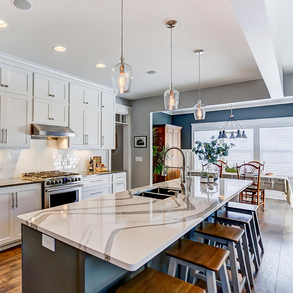
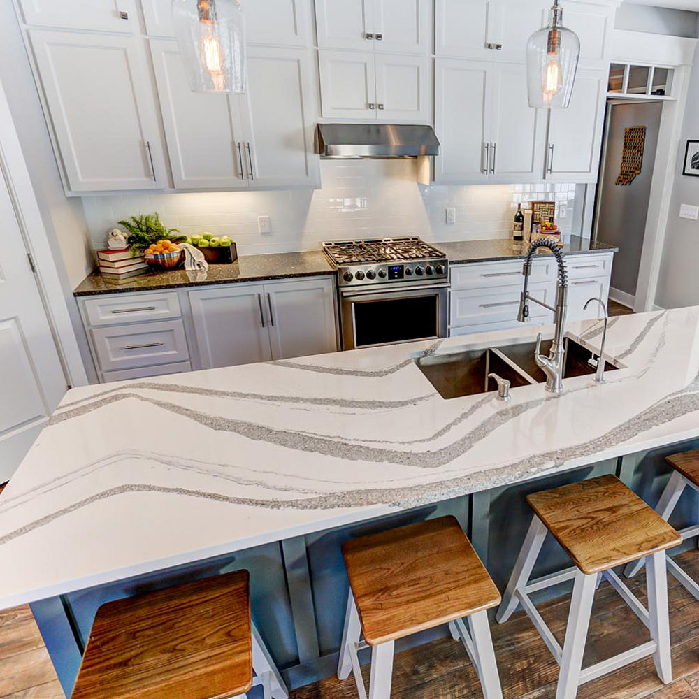
This space showcases the classic layout to feature two countertop designs: one design as a focal point for the kitchen island and a complementary design for the perimeter. Creating a bold focal point with Annicca makes this kitchen feel much larger and provides intriguing texture for the island. Minera serves as an elevated neutral that breaks up the white cabinetry on the perimeter. A contrasting gray paint color for the island further balances the space.
See the reverse of this look with a monochromatic island and a bold perimeter design in one of our favorite green kitchens from The Little Green Notebook, featuring industrial gray Carrick™ and marble-alternative Brittanicca™.
2. Classic Gray and White: Ella™ + Fieldstone™ Countertops
In this elegant and neutral pairing, the delicate gray veining and light whitish gray backdrop of Ella pair perfectly with the dark, slate gray of Fieldstone. This combination offers high-contrast style that’s not as dramatic as a black-and-white kitchen. Against white subway tile, the Fieldstone perimeter catches the eye but lets the marble movement of Ella be the star.
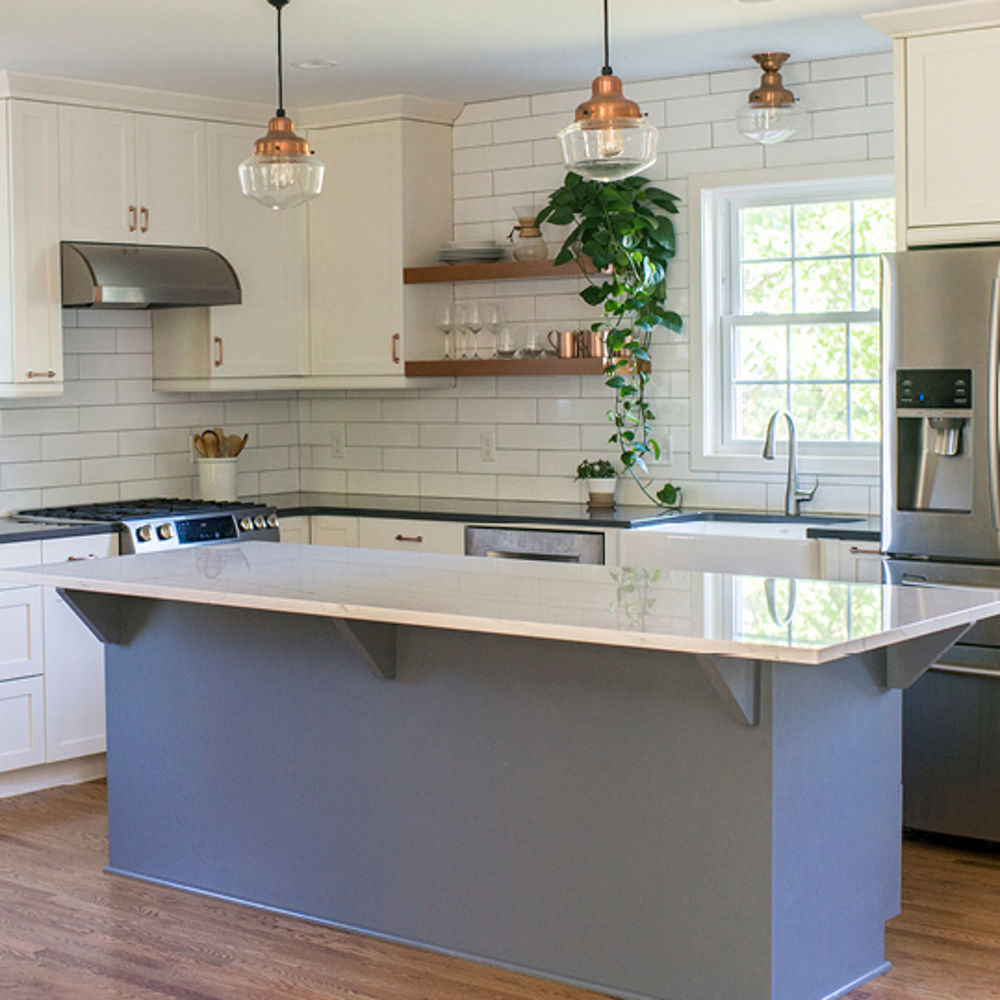
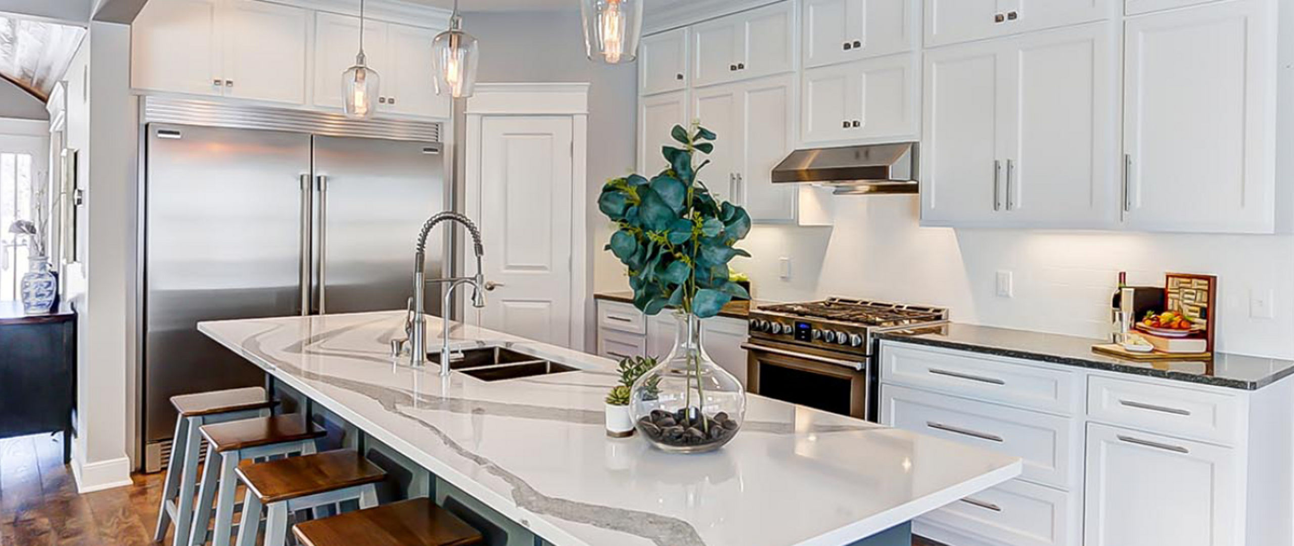
A Fieldstone perimeter contrasts an Ella kitchen island in this traditional farmhouse kitchen.
This farmhouse kitchen uses varying shades to update a gray-and-white palette. White subway backsplash and cream cabinetry achieve a clean and classic look. This allows for a pop of color on the island and mixed metal accents to shine. Ella’s marble look offers a luxurious focal point that fits with any space or style—check out our three favorite installs featuring this dreamy design.
Prefer a darker look for the island? See a statement island featuring a sophisticated granite alternative in this two-tone kitchen featuring Helmsley™ and Fairbourne™. And if you’re a fan of gray kitchen style, check out our tips for getting the perfect palette.
3. Bold Movement: Brittanicca™ + Roxwell™ Countertops
Larger kitchens have more counter space to play with patterns, textures, and colors. Embrace the opportunity to showcase two captivating designs like Brittanicca and Roxwell, with complementary cream and gray tones and powerful movement. The bold patterns of these two designs work in tandem with Brittanicca’s marbled veining and Roxwell’s wave-like movement.
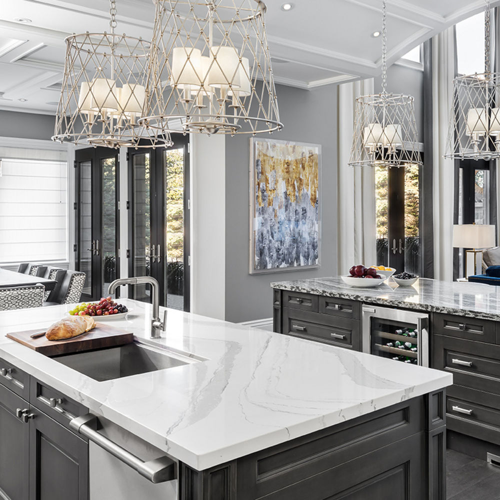
Two distinct islands featuring Brittanicca and Roxwell pair with layers of gray in this luxe open kitchen. Photo by Steve Henke.
Depending on the size of your kitchen, a double island layout may help you optimize your space in style. In this kitchen, the Brittanicca island serves as a prep space, while the Roxwell island is designed for casual dining. Roxwell’s shimmer is accentuated with metallic hardware and lighting. A Brittanicca fireplace in the living room bookends the open space and extends Cambria’s stunning beauty throughout the home.
See another double island look with a warmer palette in this two-tone kitchen featuring Brittanicca Gold Warm™ and White Cliff™.
These spaces prove that you don’t have to limit yourself to one Cambria design, or even one finish. With Cambria’s extensive design palette, there are endless ways to mix and match countertops to achieve a look that reflects your personal style.
Get started on your two-tone kitchen project by ordering samples of potential design pairings. Discover other favorite combos on our perfect pairings Pinterest board.
Discover More
Get our beautifully curated collection of lifestyle stories, interior design trends, and expert advice sent straight to your home and email inbox with a complimentary subscription to Cambria Style magazine.
Ready to explore Cambria quartz designs in person? Contact a Cambria consultant or use our retail locator to find a professional in your area for project support and planning, material selection, or visualizing what’s possible.
Explore the #MyCambria Gallery to see how others transformed their spaces and follow us on social media.
Get the Look
Explore the designs featured in this story.

