I live and work in a tiny house. I’ve been here for seven years, and I’ve lived in numerous apartments of similar size in the past. For me, the main difference between small-space living now vs. then is that my family has grownopens in a new tab. It used to just be me and my beloved beagle-mix. Now I’m married, and my husband and I have a toddler. We also adopted a second dog. That means that there are five of us living in under 400 square feet.
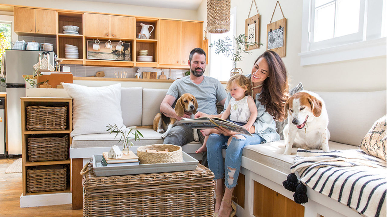
Whitney Leigh Morrisopens in a new tab and family in their Tiny Canal Cottageopens in a new tab. Photo by Marisa Vitale.
Tiny Kitchen Makeover Must-Haves: Hardworking Materials with Style
In a little home or apartment, everything gets way more wear and tear than a “normal”-sized home—particularly when lived in by an entire family. As such, it’s crucial that the space is constructed with high-quality materials that are capable of sustaining and weathering heavy use.
Similarly, almost every area in a tiny house is visible from every point, so it’s equally as important to keep materials looking beautiful.
One of the key factors in making our compact cottage functional for us all is finding uninterrupted surface space. Surfaces are precious and at a minimum in any small dwelling, and it’s important to keep them open and available for multiple uses throughout the day. As such, I always make our bed, clean my desk, and—most importantly—keep our kitchen counters as cleared as possible.
An Overdue Update on Tiny House Countertops
For years, our tiny cottage had granite countertops that we didn’t love. They were black and speckled, which didn’t work for the context. The black granite countertops also looked out of date, displayed visible seams, and featured a super thin format. The dark color cluttered the kitchen, and seemed to absorb the sunlight that could otherwise enlarge the feeling of our home. Overall, the dark countertops made the kitchen clash with the rest of our bright and airy home.
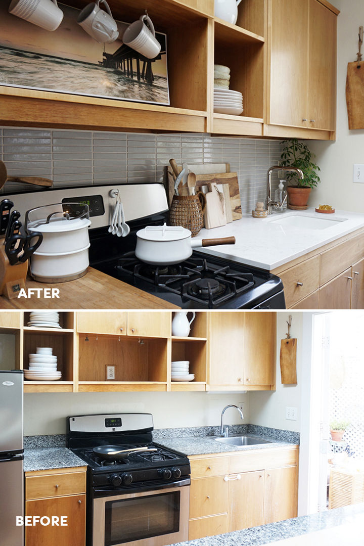
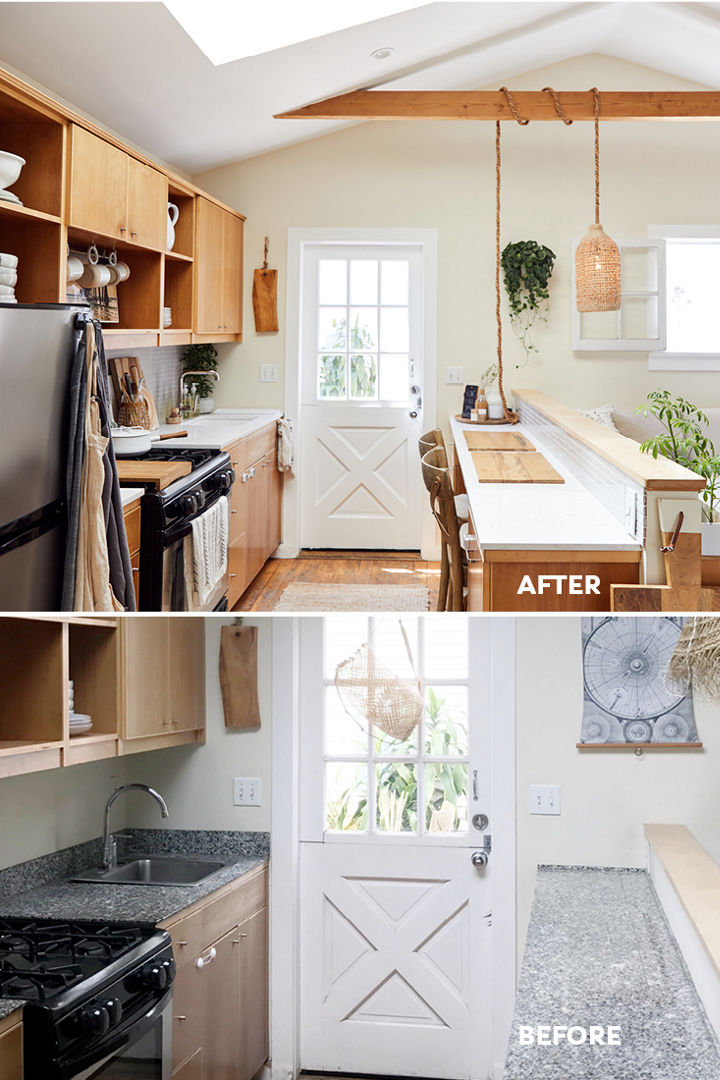
BEFORE: Tiny house kitchen featuring dark granite countertops. AFTER: Whitney’s tiny house kitchen makeover with Torquay countertops.
Choosing Cambria Countertops
I was craving bright countertops, but I also wanted something with slight texture. Nothing overly marble-y, nothing speckled, and nothing too heavy in appearance. In order to help increase the light and visual space within the room, I also wanted something slightly reflective. And I wanted to make sure my countertops were easy to maintain and would stay looking beautiful after years and years of use. I found an ideal solution to satisfy all of these requirements—Cambria’s Torquay countertops.
I love the characteristics of Torquay, which looks like a magical blend of sand and stone. It breathes new life into our home to now have the white, light-reflecting Torquay countertops, which are also the proper thickness for our space.
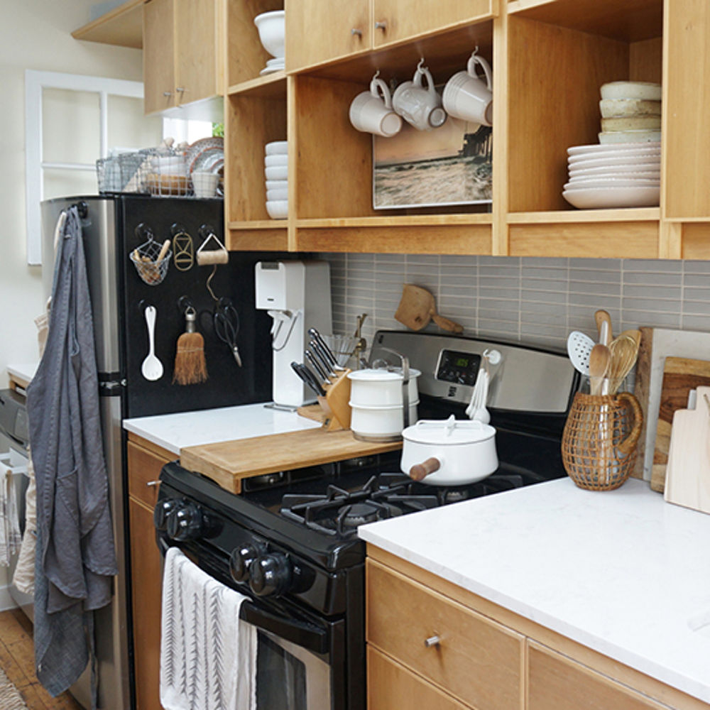
Cambria Torquay countertops.
The Simple and Quick Kitchen Countertop Installation
The removal of the old counters and the installation of the new Torquay tops were a breeze. The process took under two hours.
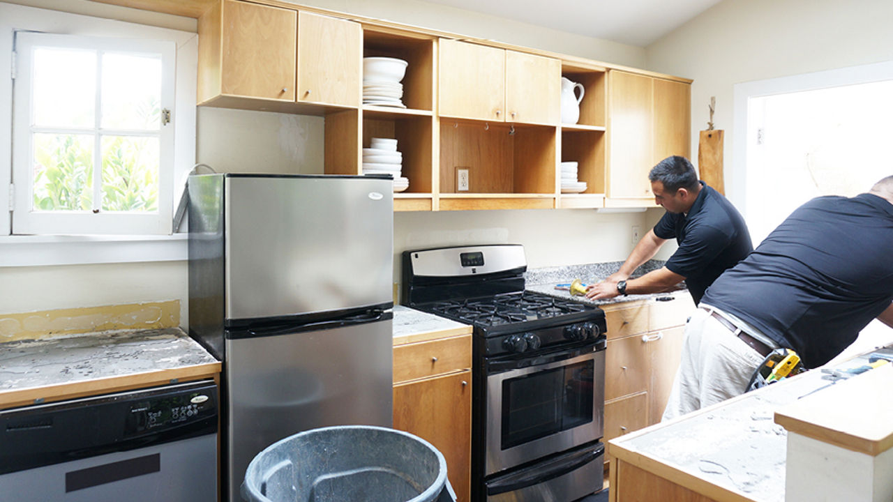
Installers remove the granite countertops in Whitney’s tiny house kitchen remodel.
The results make such a massive difference in the look and feel of our tiny home and complement our light wood cabinets. I regret waiting so many years to make the countertop update.
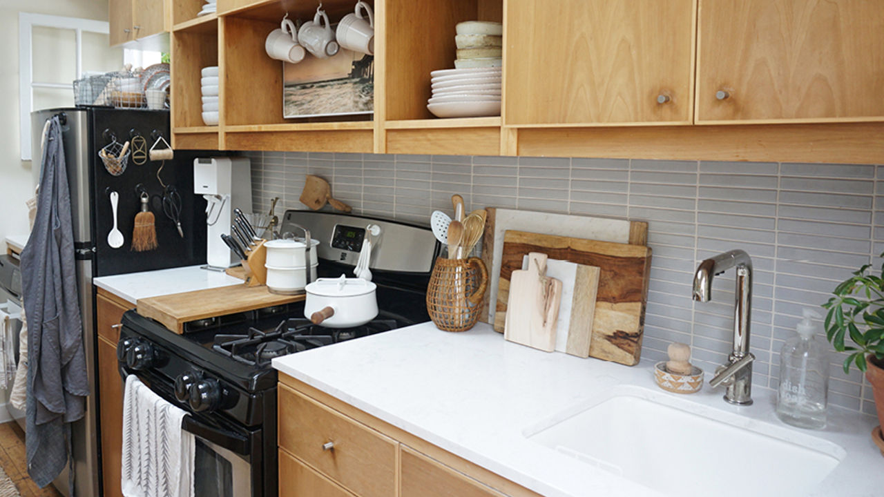
Open and airy small-space kitchen after the installation of Cambria countertops. Photo by Babble by Disney.
Next Up: A Tiny Home Rental Property Renovation
I learned from my positive experience renovating my kitchen with Cambria, and have already acted upon it.
Recently we began renting a second tiny cottage, which sits just eight feet away from our own. We mainly use this extra space to accommodate friends and family visiting from out of town, but we also use it for the large production crews who visit our tiny home frequently for the photo and video shoots that are an integral part of my small business.
As renters of this second cottage, we didn’t want to pour too many resources into it. However, we knew that there were certain features that we had to change in order to make the space our own. Item one on the list was doing a mini-makeover of the kitchen, and replacing the countertops.
Upon first glance, the old countertops in the second tiny house kitchen weren’t terrible—but if you looked carefully, you could see stains and seams everywhere. Not only was the quality of the surface not ideal, but the shape and cut of the counters didn’t help maximize the small space. They were also improperly measured and stopped several inches short of the stove, leaving a large, awkward gap in the kitchen.
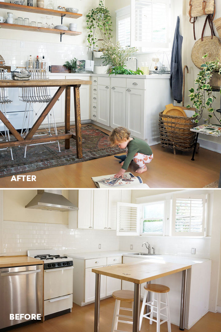
Whitney’s rental kitchen before and after.
The second tiny house’s structure has a much cozier vibe than our main home—it’s more like a British cottage than a beach bungalow.
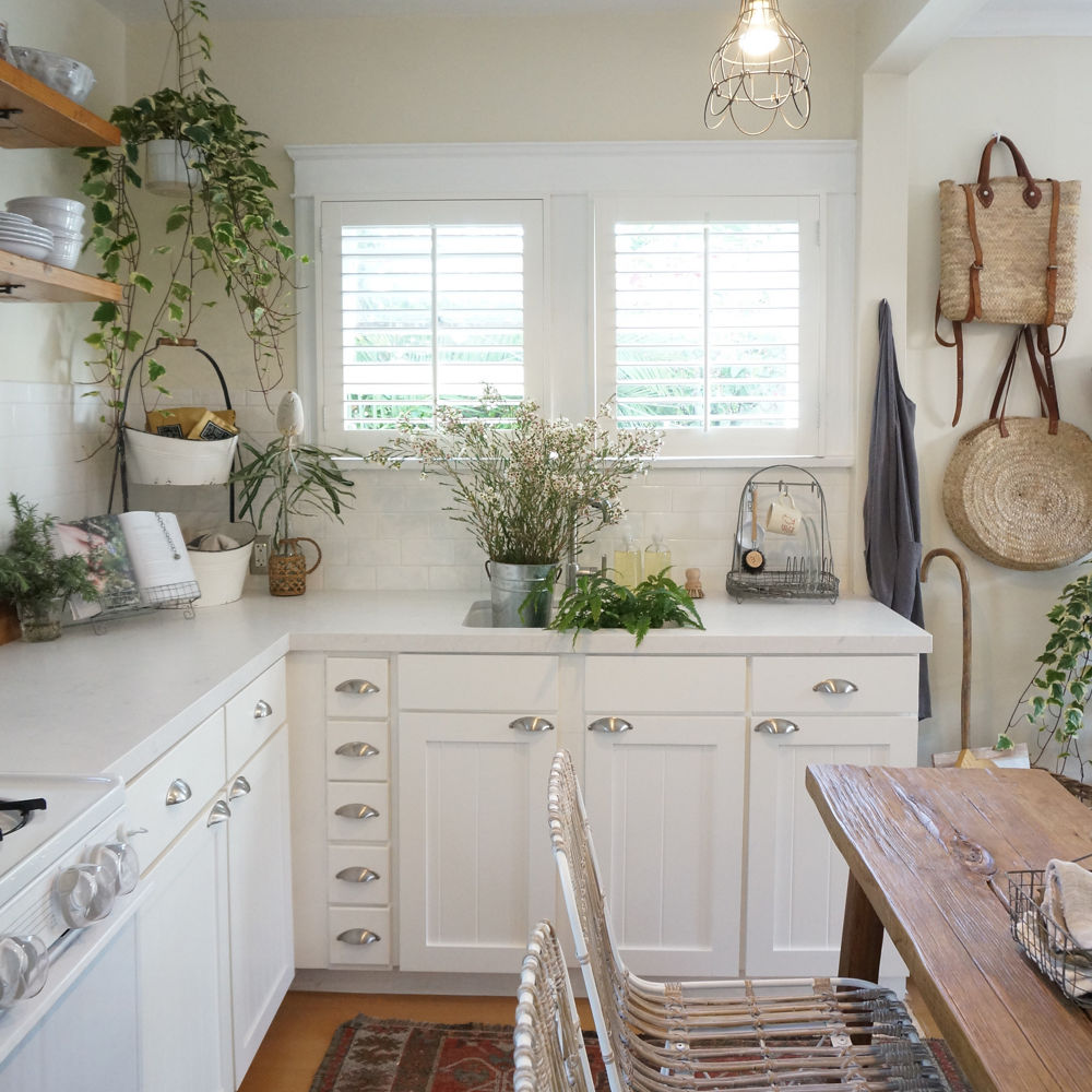
Chic small-space kitchen with white Cambria countertops in Weybourne Matte™. Photo by Lily Glass for SFGirlByBayopens in a new tab.
The new Weybourne Matte countertops made the entire house appear polished and clean without looking unfittingly modern. With renters coming and going, we love that they won’t scratch or stain and are easy to clean. They’re absolutely perfect for us, and for the space. We now have an improved kitchen layout, and enjoyed a smooth Cambria installation process just like our first cottage kitchen remodelopens in a new tab.
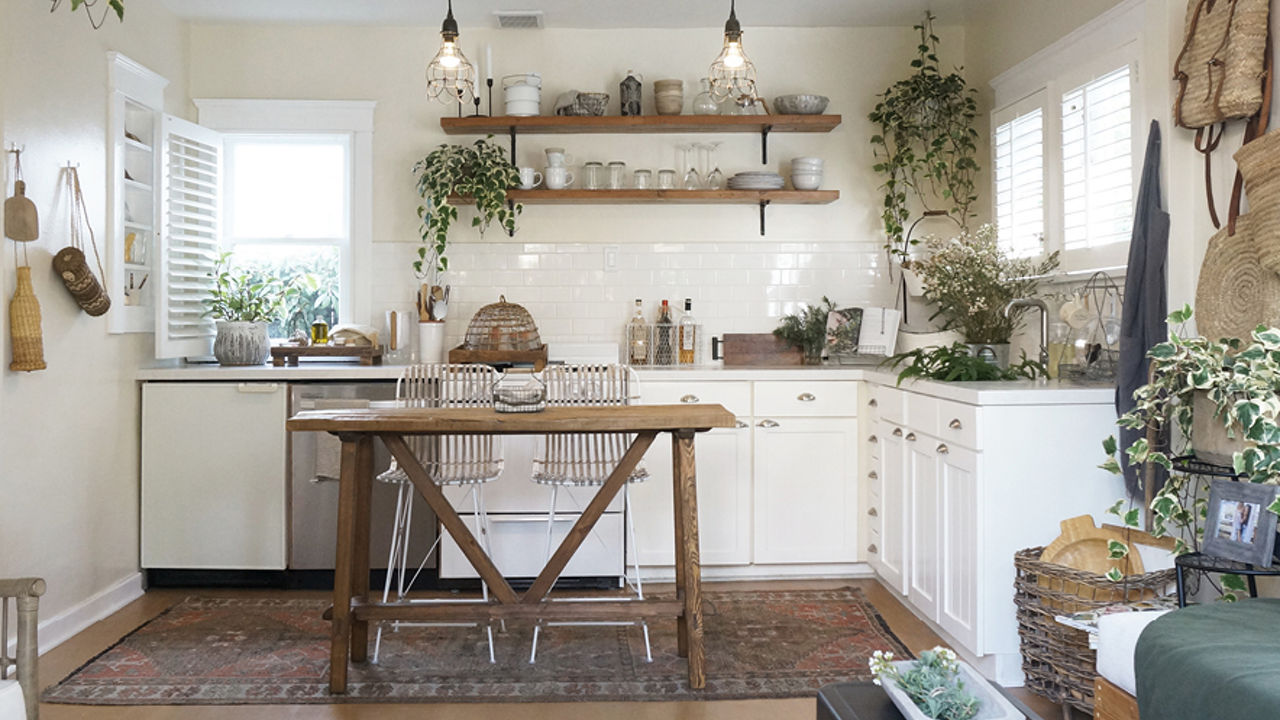
Earthen textures, Weybourne Matte countertops, and cheery kitchen plants make for an inviting rental kitchen.
So now I know. Regardless of the style and size of my next living space, one of my top priorities (and joys) will be installing gorgeous new countertops from Cambria.
Reward Your Space with Luxury Cambria Quartz Countertops
Planning a tiny home kitchen or other small space? Check out these design tips for small kitchens.
[Updated on 2/15/2024]
Discover More
Get our beautifully curated collection of lifestyle stories, interior design trends, and expert advice sent straight to your home and email inbox with a complimentary subscription to Cambria Style magazine.
Ready to explore Cambria quartz designs in person? Contact a Cambria consultant or use our retail locator to find a professional in your area for project support and planning, material selection, or visualizing what’s possible.
Explore the #MyCambria Gallery to see how others transformed their spaces and follow us on social media.
Get the Look
Explore the designs featured in this story


