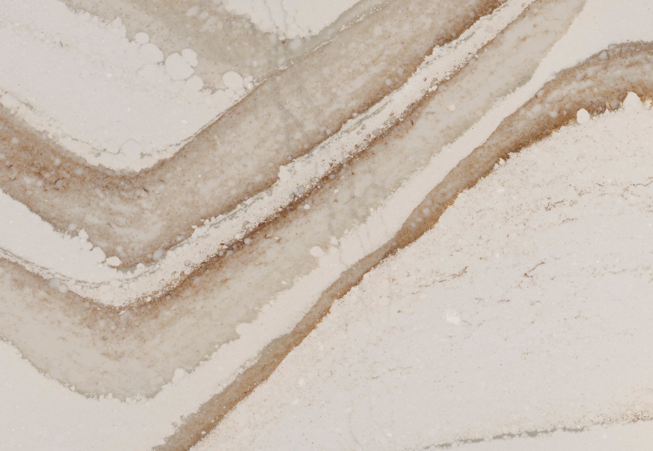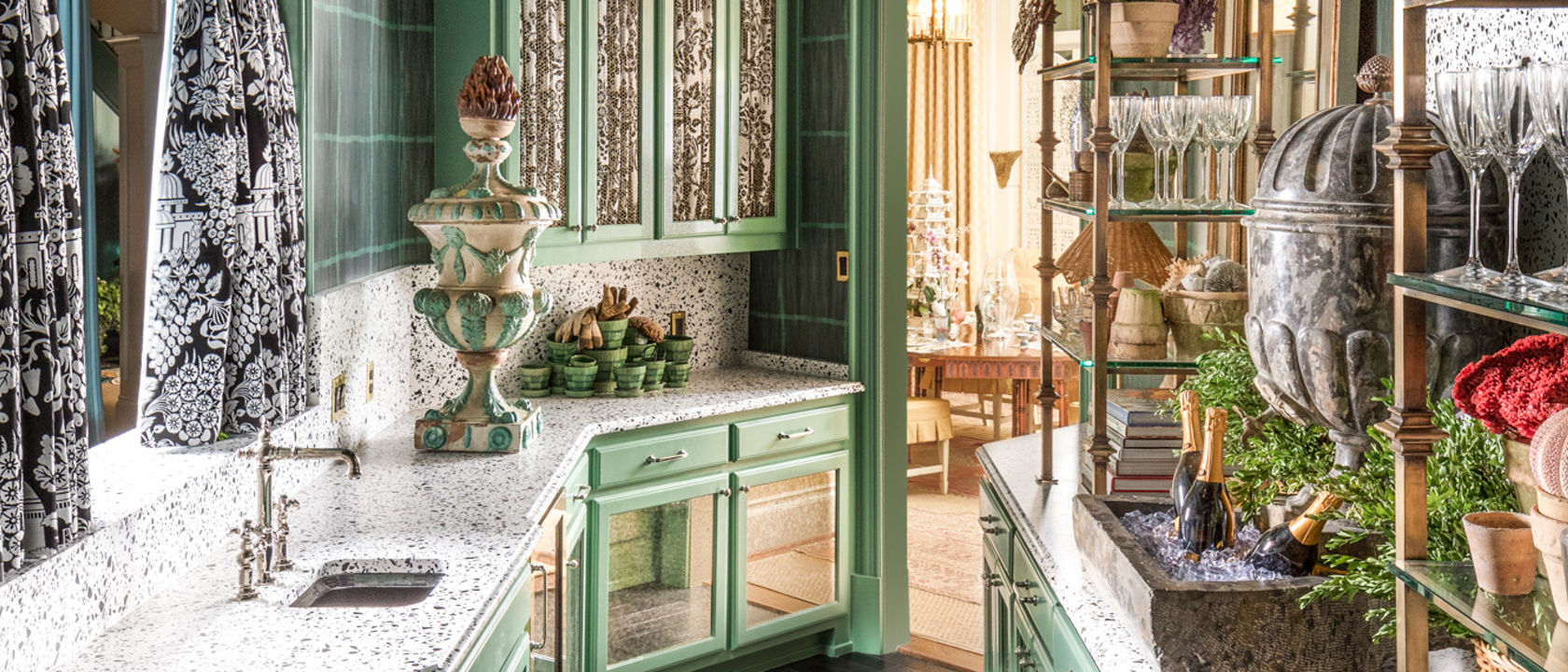
Cambria’s Vail Village Matte™ (Gensler product design consultant) pops in this Kips Bay Decorator Show House Dallas.
Who’s ready for 2021? We are already looking ahead to the New Year and, of course, to embracing myriad up-and-coming design trends.
From green kitchens and maximalist design to modern, desert-style aesthetics and customizable home offices, we’re sharing the interior looks that will be “in” this year.
Evolution of the Green Kitchen
You probably think you know green, but you haven’t seen it like this. In 2021, we will “go green” with bold and beautiful spaces that contrast with the farmhouse chic hues of seasons past (ahem, Pantone 2017 Color of the Year Greenery).
In this party-ready bar for the Kips Bay Decorator Show House Dallas, SEES Design paired modern terrazzo-like Vail Village Matte countertops from The Coordinates Collection by Cambria™ with a rich Benjamin Moore sage green shade.
“Vail Village Matte countertops, brass shelving, and 18th-century terra-cotta urns make the room feel like a luxurious greenhouse, while near-priceless antiques and Regency-style mirrors elevate the space,” wrote Lauren Wicks for Veranda.
Finished with a Monogram wine fridge and gorgeous glassware, this quirky-yet-sophisticated bar is sure to be a hidden gem to which party guests can steal away. Arteriors pendant lighting and a curated stack of books from Caitlin Wilson also make this bar an excellent secret reading nook.
Known for their eclectic, high-end designs that marry modern pieces with international flourishes, the husband and wife duo behind interior design firm French & French Interiors based in Santa Fe, New Mexico, created a classically elegant kitchen with our Bentley® design.
Throughout the space, the team relied on a standout Bentley countertop to contrast against the island’s natural wood base with vertical architectural lines, to play with the oversized refrigerator paneled in matte black, and to highlight a shiny green tiled backsplash above the stove.
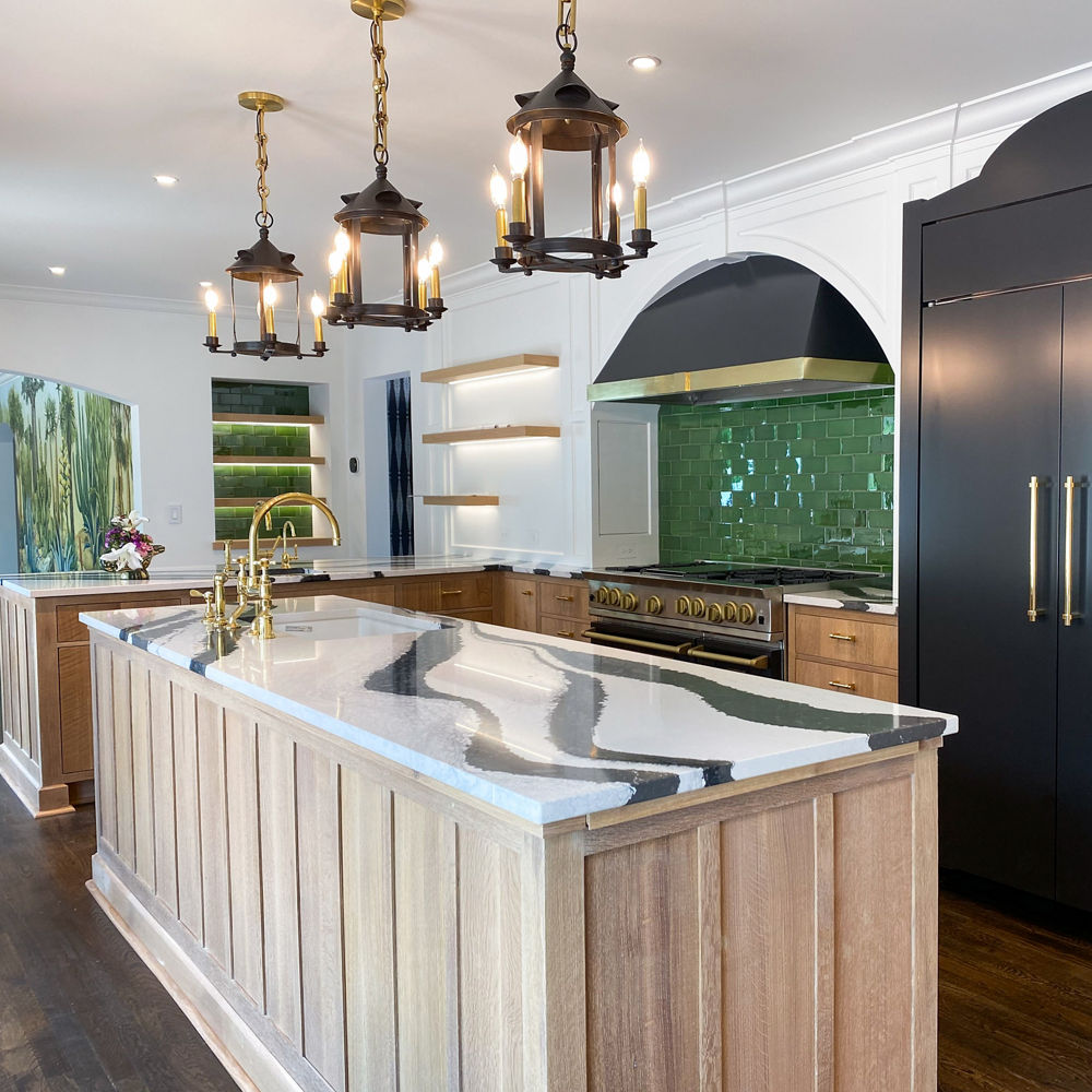
Cambria Bentley adds dimension without taking away from this kitchen’s myriad bold details.
In this mid-century kitchen, New York–based international interior designer and tastemaker Alberto Villalobos emphasized an eye-catching green hue on the cabinetry by adding a lacquered finish. In his work, he strives to create unique environments that are relevant, functional, livable, and always timeless.
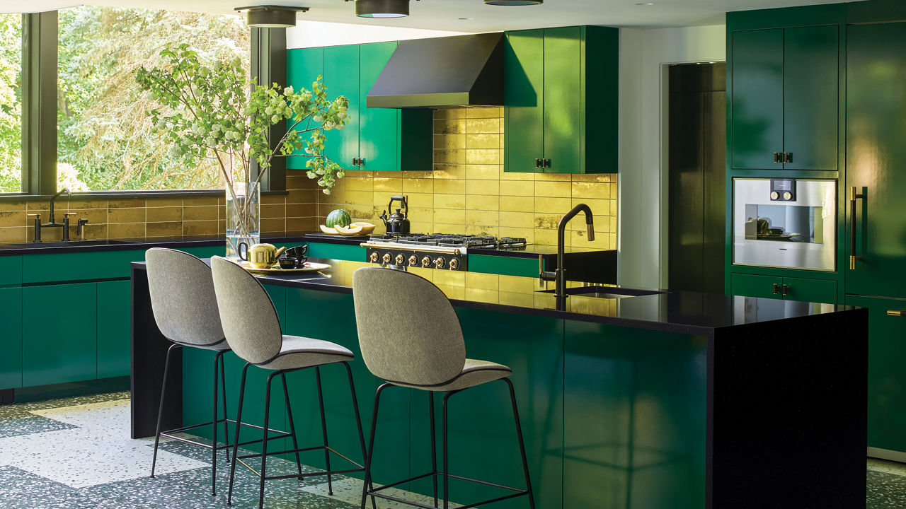
Cambria Black™ countertops highlight the bold green cabinetry in this mid-century kitchen design.
Here you’ll find even more green kitchen ideas to spark inspiration.
Study Space
The home office quickly became the “it” room of 2020 and, in the New Year, the space will continue to dominate. But we’ll make the now-essential spaces even more personal and custom to facilitate work, study, and play time.
In this stylish office nook by AFT Construction, working from home never looked so chic with Cambria Swanbridge™ countertops, warm white cabinetry and walls, richly hued hardwood flooring, and rose gold hardware and fixtures.
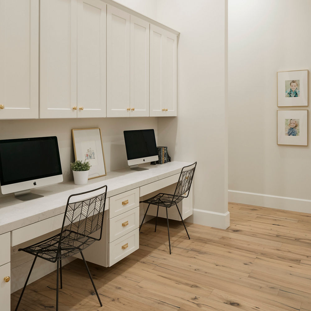
This space is beautiful enough to inspire without being a distraction from the task at hand.
A Brittanicca Gold Warm™ fireplace surround is a stunning pairing to blonde woods and matte navy in this moody and mod home office by Louisville-based Artisan Signature Homes.
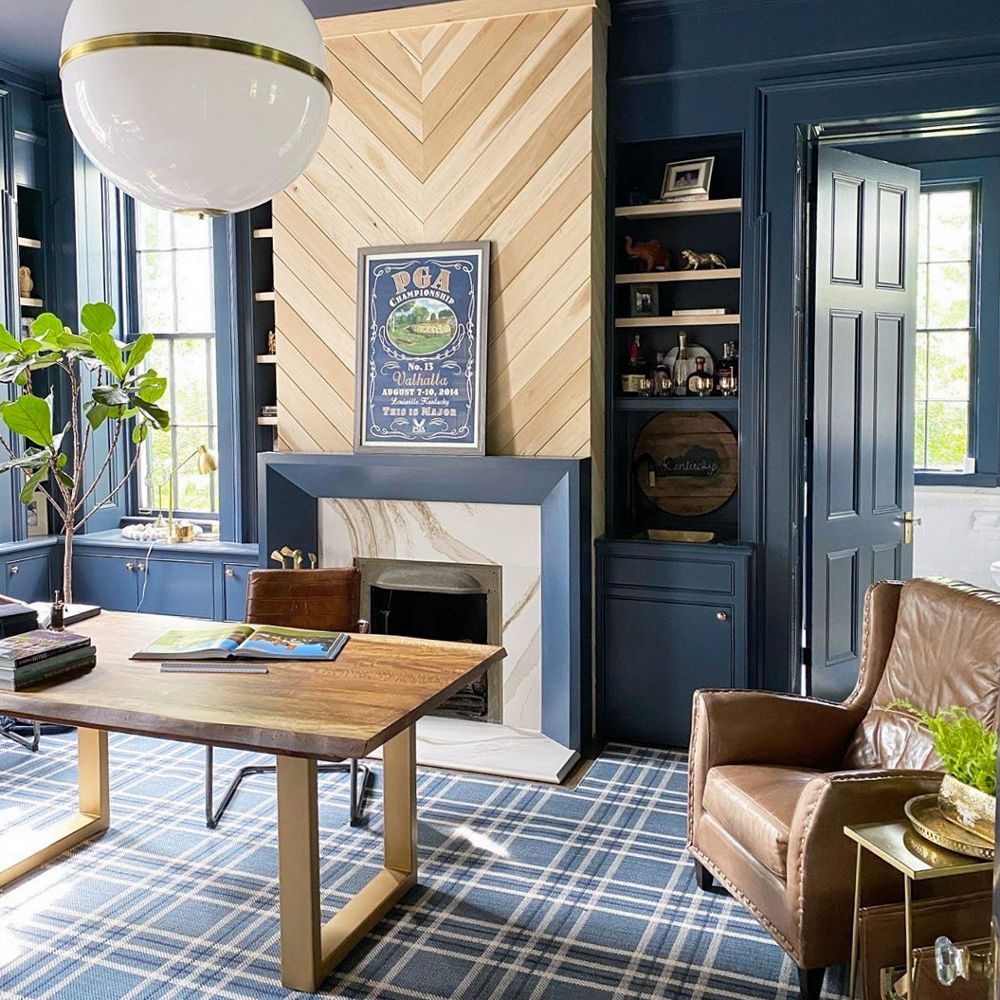
As people spend more and more time at home—and in their home offices—high-design like this makes the experience that much more pleasing.
Does your laptop often end up on your countertops, or has your kitchen island become a homework help-desk? Then consider a kitchen workstation the ideal update for your home. Try a dedicated space with a built-in working surface and storage to help keep your kitchen organized and your countertops clear.
If you’re planning a kitchen remodel, consider incorporating a built-in desk into your plans. Using the same countertop as your kitchen keeps the design cohesive, while choosing a complementary design for the desk will set the workstation zone apart.
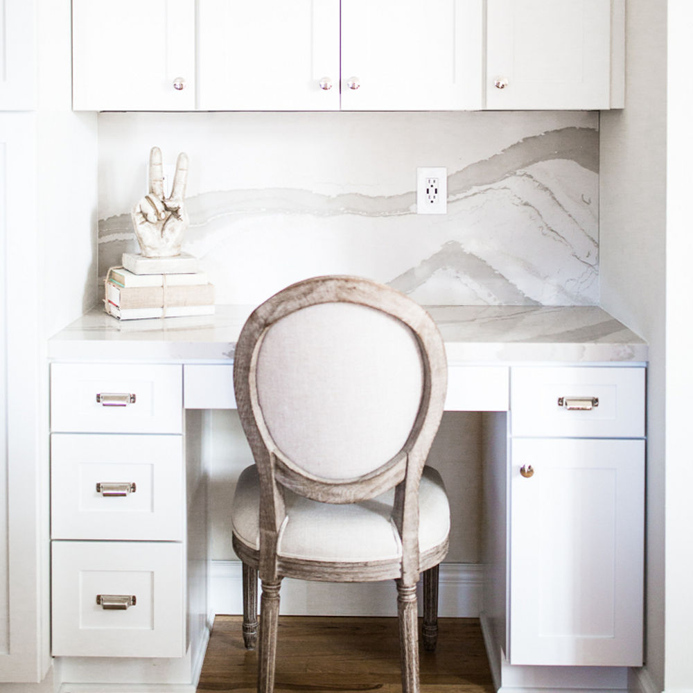
The elegance of blogger Mia Mia Mine’s white kitchen featuring Brittanicca Warm™ translates effortlessly to a desk with coordinating backsplash.
Here, tips for creating a dreamy at-home work space.
New Seating at the Table
As we spend more time at home, we have continually reimagined the functionality of our spaces. Nowhere is that clearer than in the kitchen, where the island has become an extension of the dining room and a multipurpose gathering place for everything from eating and cooking to studying and working.
Designers Jennifer Austin-McGrath and Angela Parker added extra seating to this Ella™ kitchen island for the Mpls. St. Paul Magazine 2016 ASID Minnesota Showcase Home Tour.
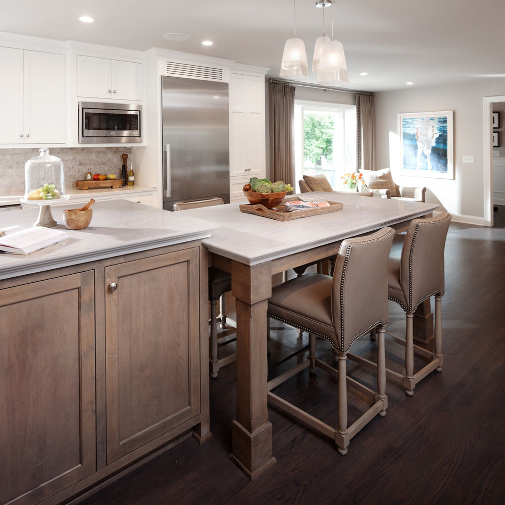
A modern upgrade to the 5,600-square-foot 1950s ASID rambler home.
Globe pendants and Cambria’s Summerhill® design combine for a glamorous take on the traditional style in this kitchen by Happy Interiors Group that features an island extension for extra seating.
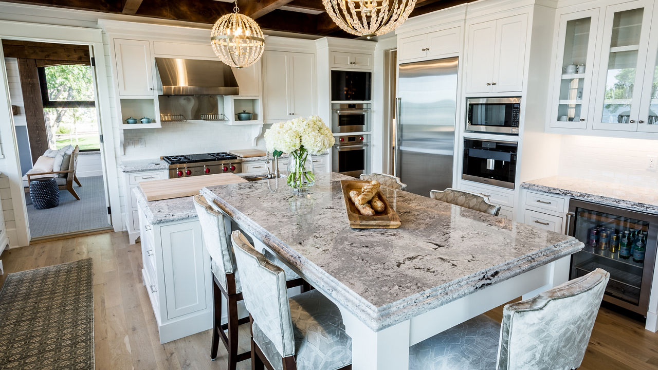
Happy Interiors Group took this Summerhill kitchen island to the next level.
Vanessa DeLeon of Vanessa DeLeon Associates curated her own Edgewater, New Jersey, kitchen with matte black cabinetry, including a matching True Residential refrigerator and contrasting copper hardware and corner details.
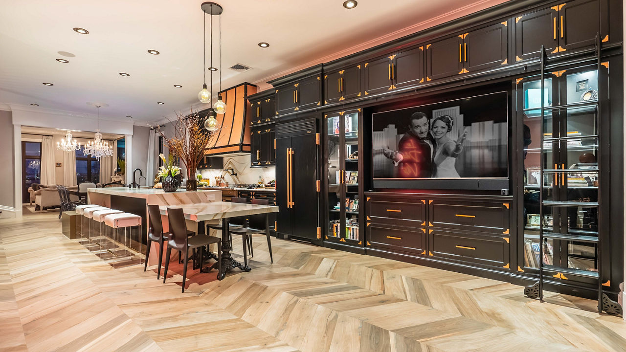
A matte black Brizo faucet and pot filler add a modern aesthetic against the massive island and backsplash in Cambria Brittanicca Gold Warm, with warm earth tones against a temperate white background, to complete the unique look.
Here, more unique kitchen island ideas.
A New Take on Waterfalls
To achieve unique design styles and aesthetics, designers are increasingly turning to the waterfall island to do the heavy lifting. Think artistic shapes to add texture and strong angles for modern looks.
In this master bathroom by Elizabeth Erin Designs and CKF, a high-contrast vanity with a Cambria waterfall edge is a stunning—and durable—alternative to marble.
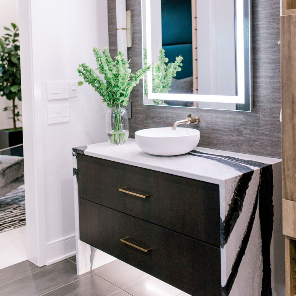
The thin profile and clean lines of this Cambria Bentley vanity create a serene retreat.
In this kitchen by Bria Hammel Interiors and Sustainable 9, a custom Cambria waterfall island in the bold Bentley design features an under-counter opening for extra seating.
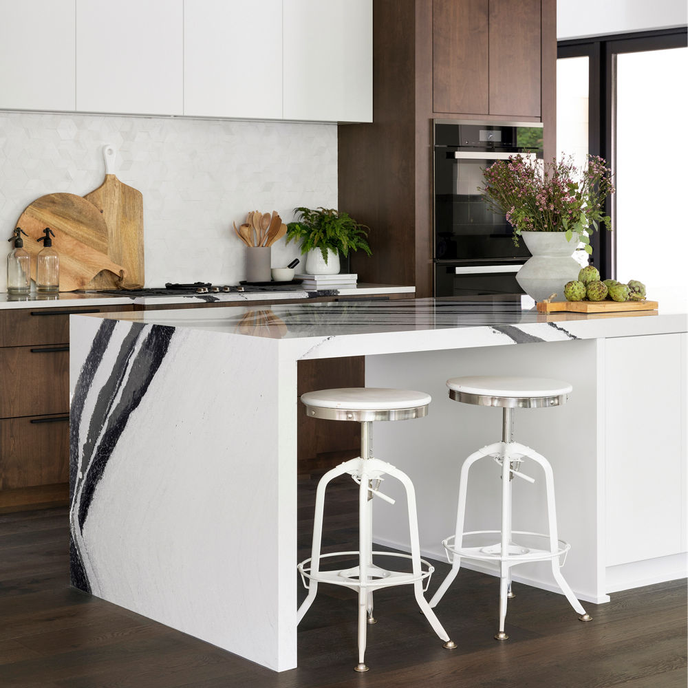
The bold movement in Cambria’s Bentley design adds to this statement waterfall island.
A luxurious master bathroom by Swanson Homes and Carbon 6 Interiors features matching Ella waterfall islands that lend structure to the airy space.
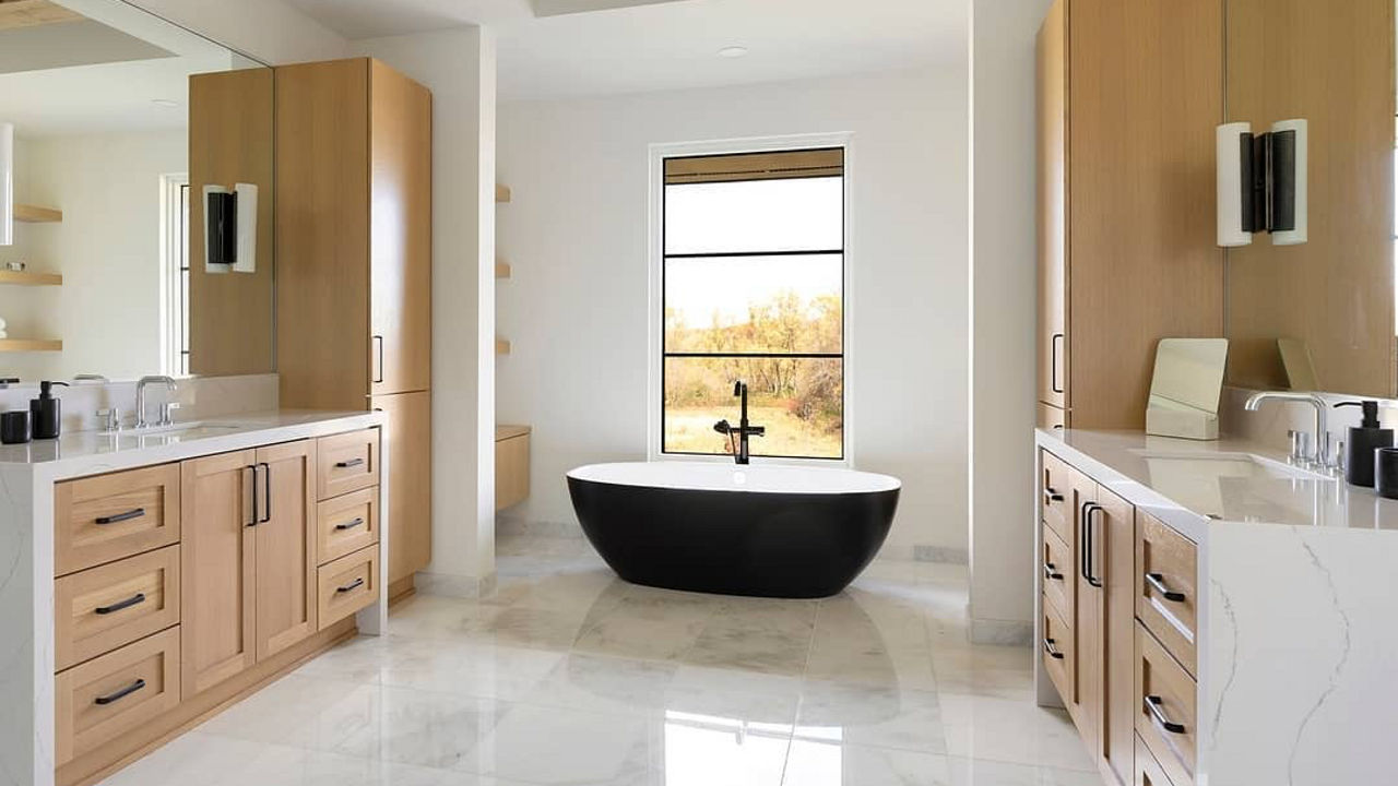
Waterfall vanities help ground this spacious bathroom. Photo by Spacecrafting Photography.
A geometric pattern with touchable texture on this waterfall kitchen island in Cambria Buxton™ by Mondragon Design + Build adds dimension to an otherwise monochromatic design.
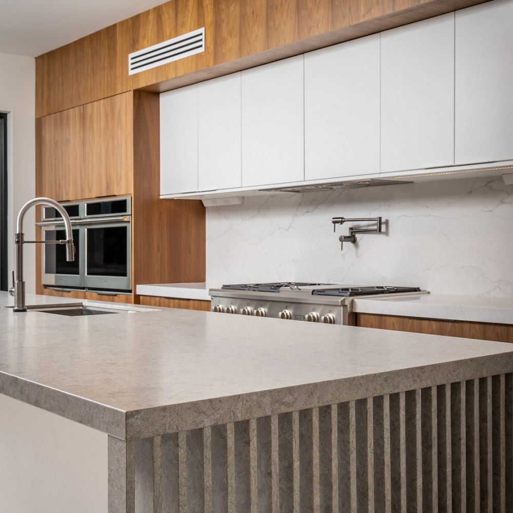
Unique design details help this kitchen stand out from the rest.
One-of-a-Kind Bookmatch Experience
Create custom works of art with Cambria thanks to the bookmatch technique that fuses art and design.
Instead of hanging a large-scale painting, the Omni Viking Lakes Hotel chose to turn Cambria’s Brittanicca Gold Warm into the guest bathroom highlight using bookmatching behind an inviting freestanding tub.
Cambria quartz surfaces are a nonabsorbent, full-slab material, so no steam or moisture can escape through its panels and there’s no grout to clean, making it perfect for bathrooms.
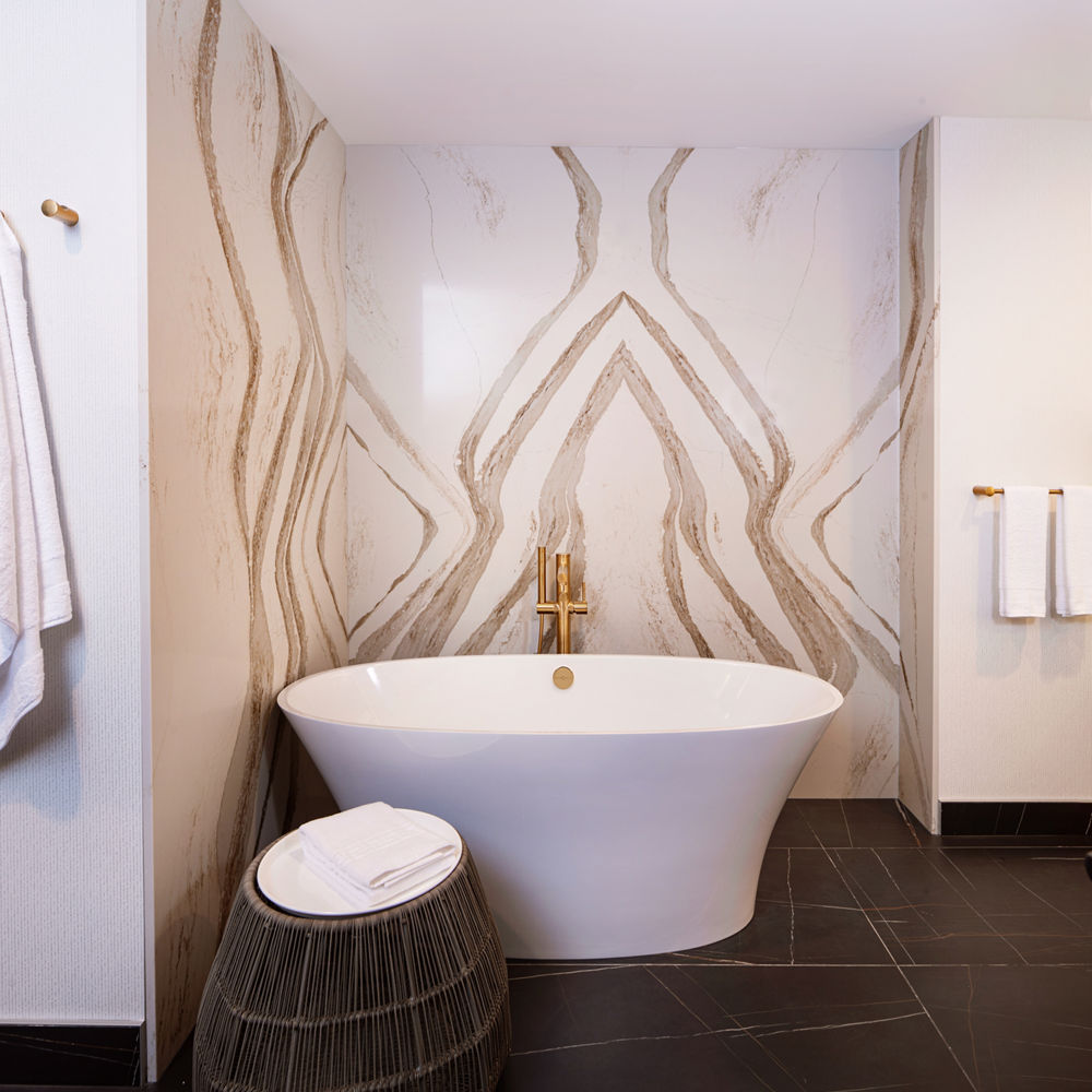
Bookmatching creates a cohesive design scheme in this hotel bathroom.
And this Cambria Bentley island stands out thanks to the bookmatching detail.
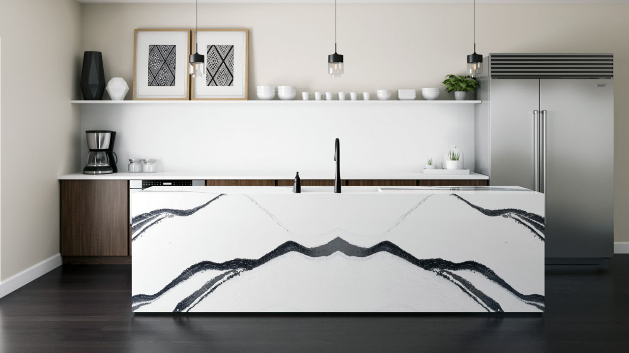
Cambria Bentley makes a statement.
Reset of the In-Home Spa
To create a true spa-like oasis in your home, consider full-height Cambria quartz wall cladding in the bathroom. Cambria can even be installed on shower walls, curbs, casings and jambs, and overhead applications.
In the master bathroom of his weekend home, O, The Oprah Magazine creative director Adam Glassman installed Cambria’s Rose Bay™ design from floor-to-ceiling.
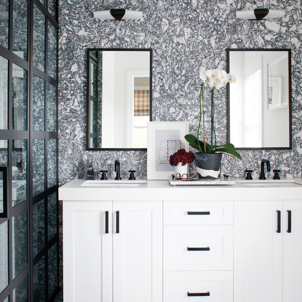
Cambria Rose Bay is a bold complement to the black-and-white palette of the small space.
In this master bath, Cambria Brittanicca™ cladding on the walls and in the shower draws the eye throughout the spacious room.
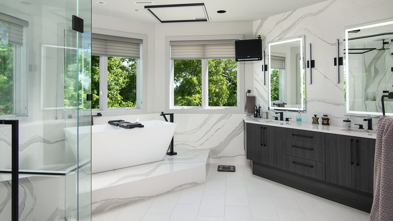
Full-height Cambria Brittanicca helps create a true spa-like oasis in this master bathroom.
In this luxurious master bathroom by Happy Interiors Group, 300 square feet of Cambria’s Annicca® design is prominently featured in the standout walk-in steam shower, the size of which was increased to accommodate a bench.
“Annicca has gorgeous bold veining, so we knew it’d be a showstopper with the size of the shower,” said interior decorator Abby Tallman, founder of Happy Interiors Group, who also used Annicca for the double sink and makeup vanities in the room. “Annicca has gold flecks that tie in perfectly with the brushed bronze fixture choices, plus it has a lot of white to complement the white cabinetry and flooring. We wanted something American made that would hold up well, be durable, and that we wouldn’t have to be careful about or continually care for, like with marble or granite.”
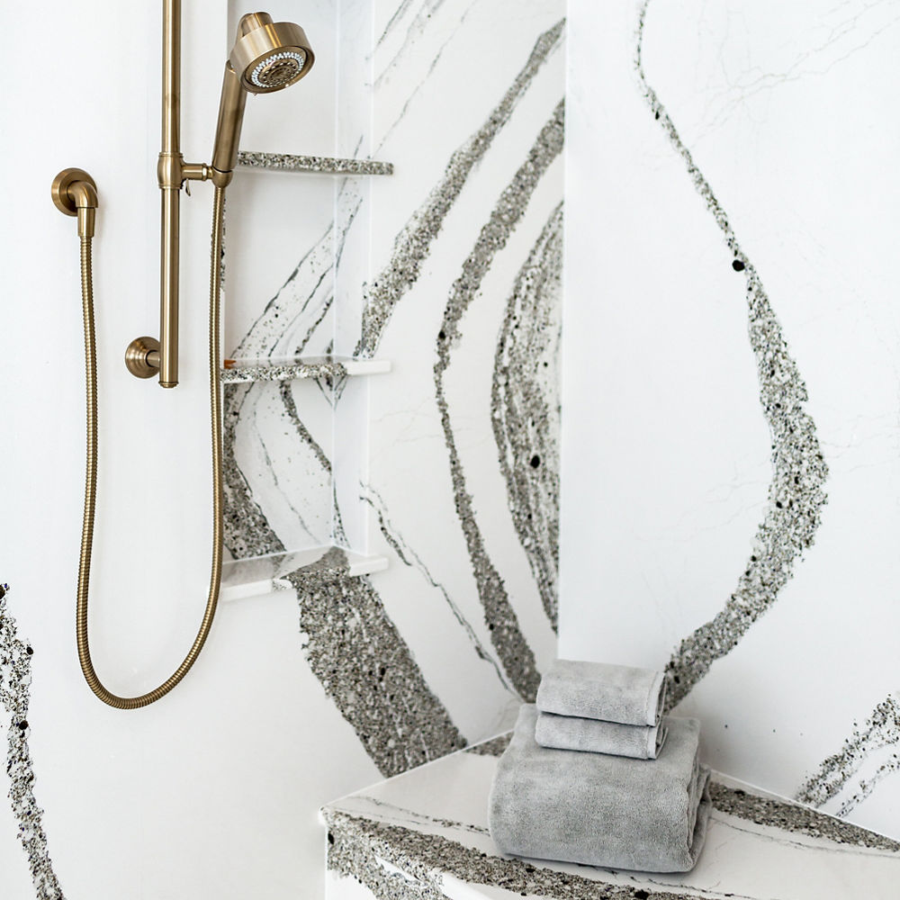
This is what 300 square feet of Cambria Annicca looks like.
When Two Become One
To create a dynamic yet cohesive palette, consider pairing two complementary Cambria designs in a single space. Try a vertical backsplash against a contrasting countertop or a statement island with a different perimeter. Mixing tones, patterns, and veining will achieve a similar effect.
After falling in love with an upstate New York cabin, HBO Girls star Zosia Mamet and her husband Evan enlisted the help of Brett and Kara Phillips, the interior designers behind High Street Homes based in Fort Worth, Texas, to breathe new life into the house.
“We wanted it to be a place of retreat for them and their extended family, which informed the design process,” said Brett and Kara. “They wanted a spot to hole up when not working, where family could visit and just hang and do creative ‘artist things,’ like read, write, and play music. It really needed to be a place to gather that felt homey but still elevated.”
For Zosia and Evan, the style of Winterbourne Matte™ felt modern on the kitchen island, and Brett and Kara liked that the Ella Matte™ design also felt natural on the perimeter countertops when paired with the blue cabinetry.
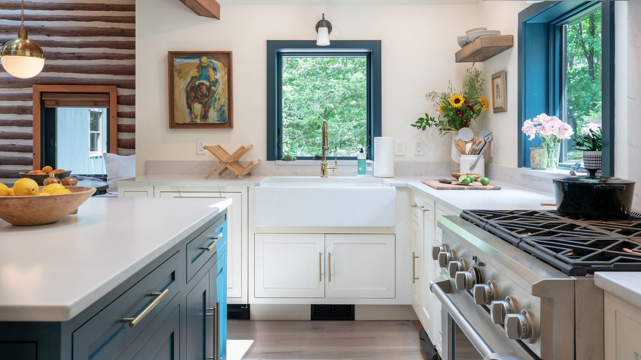
Cambria Winterbourne Matte and Ella Matte play nice in this upstate New York kitchen design.
For the Kips Bay Decorator Show House Dallas, designer Chad Dorsey created a prep kitchen, pantry, and work-from-home space to assure that all the day-to-day messy work stays out of the way.
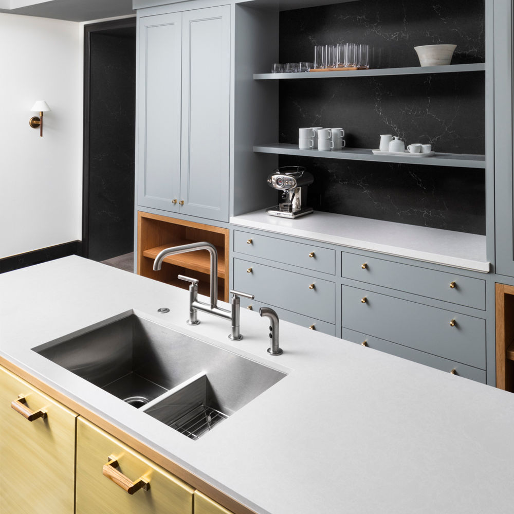
The designer paired a Cambria Charlestown™ backsplash with Foggy City™ (Gensler product design consultant) countertops for a “European elegance-meets-industrial-edge aesthetic.”
This lake home kitchen offers relaxed and refined coastal style with a Skara Brae® island with taupe-toned wood cabinetry. A coordinating wood range hood and pop of patterned tile combine to create a compelling focal point, and Cambria Black™ in a matte finish perimeter countertops add contrast and create a cohesive look with the living room fireplace in this open-plan layout.
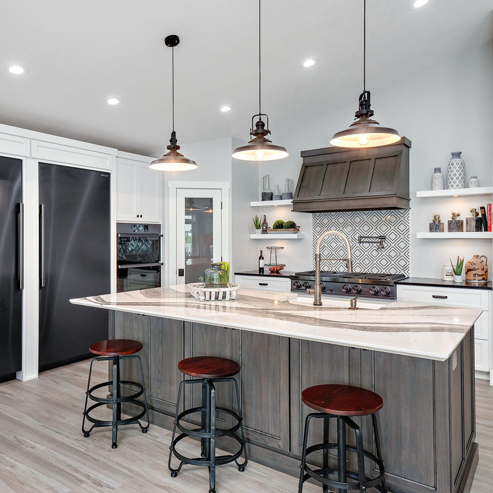
Space by West Central Home and Surface Elements.
Here, more Cambria combinations we love.
Sustainability of a Full-Height Backsplash
We still love the clean and streamlined aesthetic of a white kitchen, especially when paired with a full-height Cambria backsplash that is both beautiful and functional.
“Great room” doesn’t quite cut it as a descriptor for this gorgeous space by husband-and-wife duo Bryan Baeumler and Sarah Baeumler. In stunning symmetry, Brittanicca serves as a sky-high backsplash in the kitchen and a majestic fireplace surround in the living room.
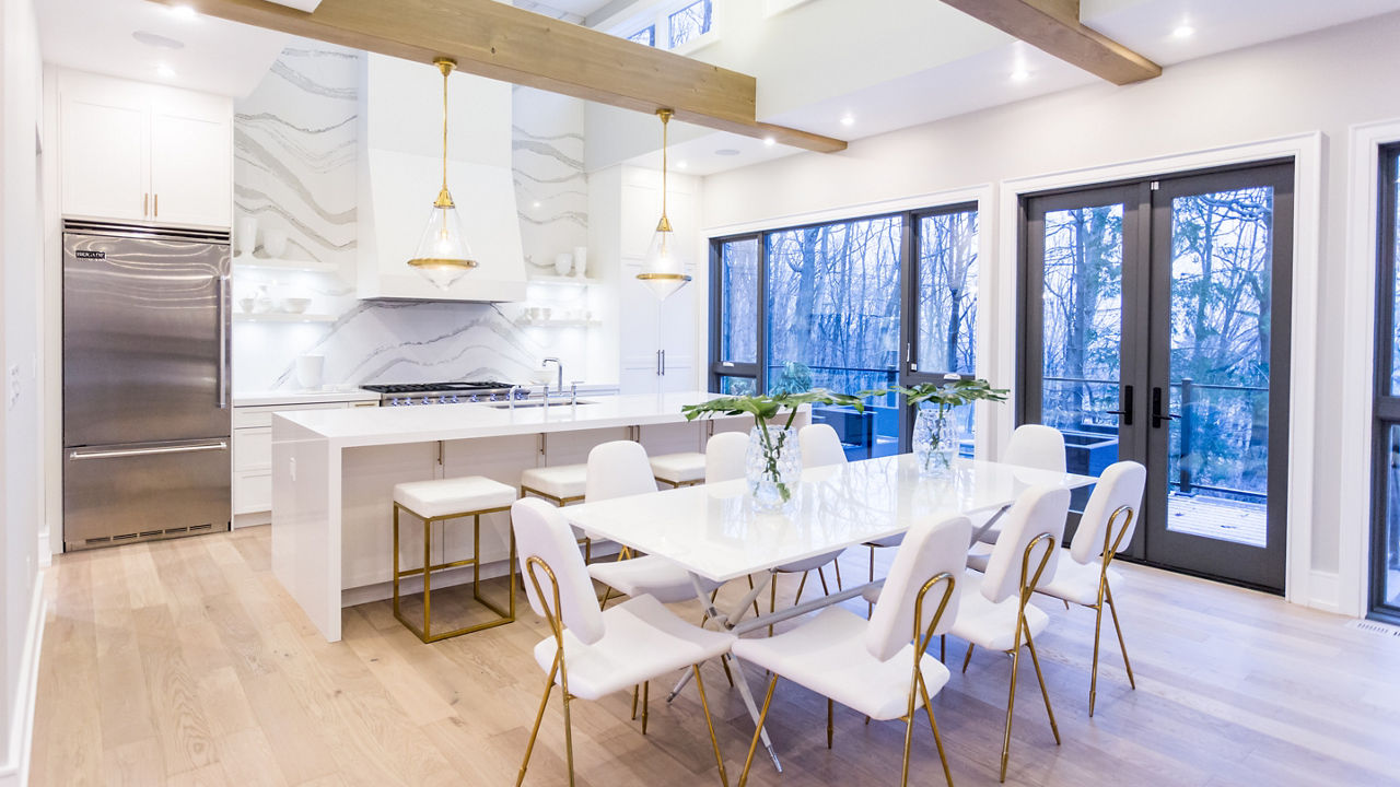
This kitchen by Bryan and Sarah Baeumler takes Brittanicca to new heights as a backsplash.
Here’s another look at Adam Glassman’s weekend home, where he added a full-height Brittanicca backsplash in the kitchen to match his island countertops.
Cambria surfaces are made from pure, high-quality quartz and feature unparalleled strength and durability.
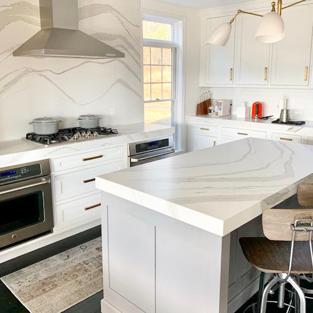
Cambria surfaces are nonporous, nonabsorbent, and NSF-51-certified, so they’re food safe; are scratch and stain resistant against common household items like coffee and wine; and they’re maintenance free.
Elizabeth Scruggs from Superior Construction designed this kitchen renovation to include a full-height Cambria Brittanicca Gold Warm backsplash and Café appliances.
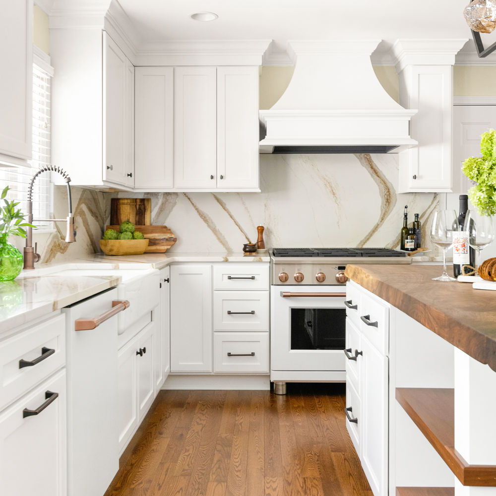
This quartz backsplash draws the eye up and adds height to the space. Photo by Sqft Nashville.
Here, backsplash ideas to spark inspiration for your next design.
Go Big or Go Home
As we head into the New Year, embrace maximalism. A contrast to the minimalist aesthetic of years past, maximalist design is a bold style comprised of mixed patterns and excessive—but curated—collections that push the boundaries in design.
In the Lake Forest Showhouse, guests are greeted by a cloak room and powder room designed by Sarah Vaile Design. She created the powder bathroom jewel box with a color palette—Sherwin-Williams Framboise—inspired by the burgundy Rolls Royce driven by Princess Margaret in The Crown. In fact, Princess Margaret served as the muse for the entire space.
“We sought to create a design that felt both original to the home and simultaneously modern,” says Vaile. “A black-and-white stone mosaic felt like a natural go-to, which is what brought us to Cambria. We loved that their latest collection offered a quartz with all the veining and visual elements of marble but yet suitable for modern living with its durable nature. We had used this fun and young geometric mosaic on a master bath project and sought to have Cambria custom create the design for the Showhouse.”
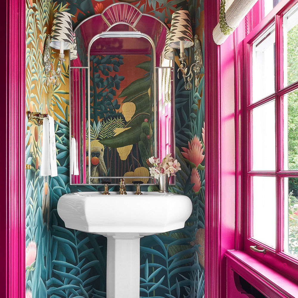
A de Gournay Rousseau wall covering, custom inverted chevron tile pattern floor in Cambria’s Mersey™ and Smithfield® designs, mirrored wall, and cheeky prints and tassels drive home the whimsical nature of the space.
For Kips Bay Decorator Show House New York, designer BA Torrey created “a cocktail intended to pique the senses,” he told 1stDibs.
“From the cerused oak of the custom millwork, brass of the stools and coffee table, crystal of the lamps, plush velvet and mohair of the upholstery, shimmery black-and-gold wheat-inspired fabric of the Hermes throw pillows, and chunky honed stone of the fireplace and Cambria Hollinsbrook Matte™ bar counter, this room was made to touch,” says Torrey.
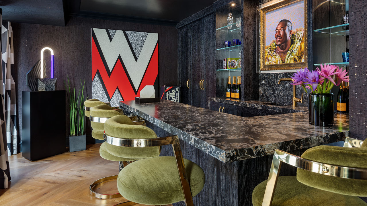
“You didn’t just look but touched and felt my 70s-inspired homage to playful decadence and indulgence,” says Torrey. “Luxurious textures filled the room, making for a highly tactile environment.”
A Twist on Open Shelving
Now de rigueur, open shelving lets homeowners both store and display their most beautiful pottery and tchotchkes—and also allows for easy access. Add a stunning quartz backsplash to anchor the shelving, and the effect is even more wow worthy.
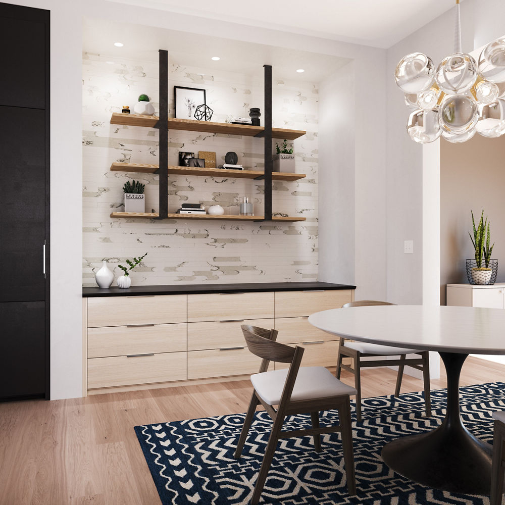
In this dining room, an accent wall becomes a focal point with Cambria Brittanicca Block™ wall cladding that spotlights custom shelving.
The prep kitchen in the Kips Bay Decorator Show House Dallas features a Charlestown backdrop by Chad Dorsey.
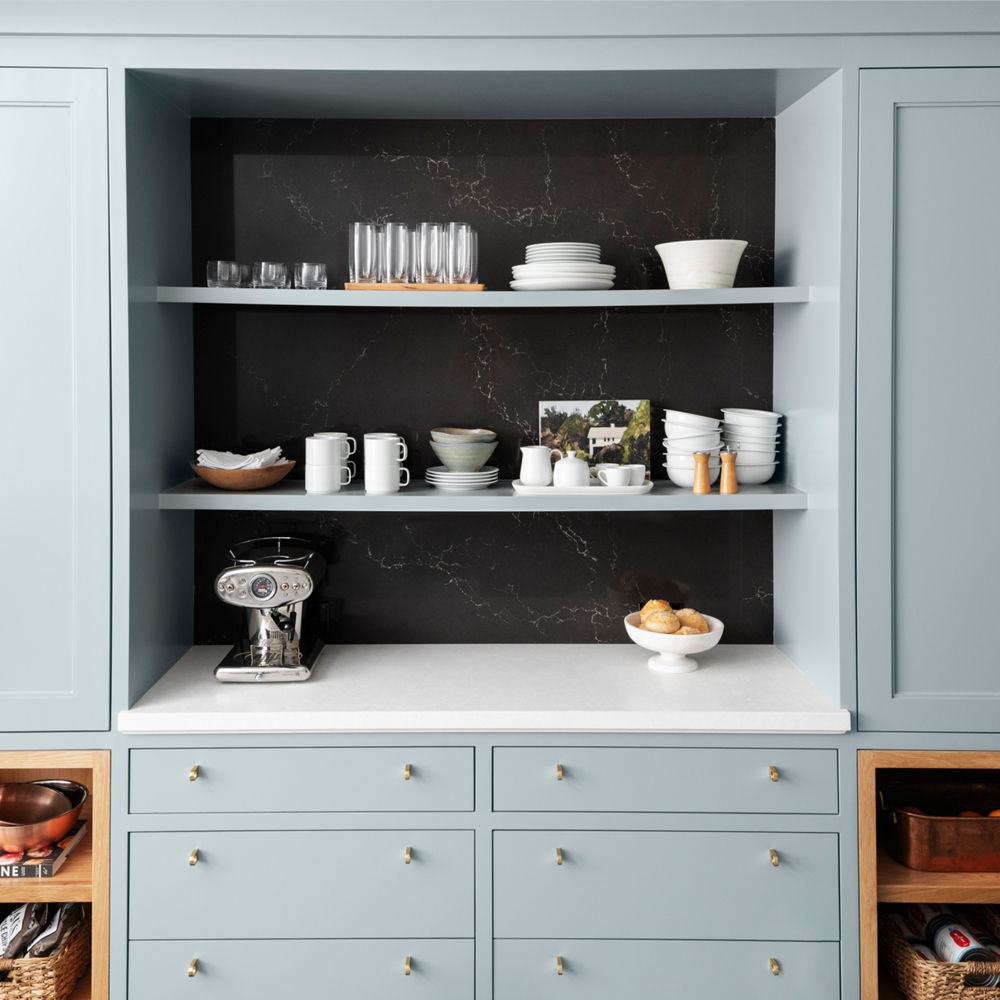
Dorsey aimed to complement the mint green hue on the shelving and lend dimension to the ancillary space with this Cambria backsplash.
The homeowners of a waterfront estate overlooking the Long Island Sound interviewed four kitchen designers before finding their perfect match in Ellen Lopez at EL Design Studio, an expert kitchen and bath designer with over 15 years of experience in the remodeling industry and a background in textiles and styling.
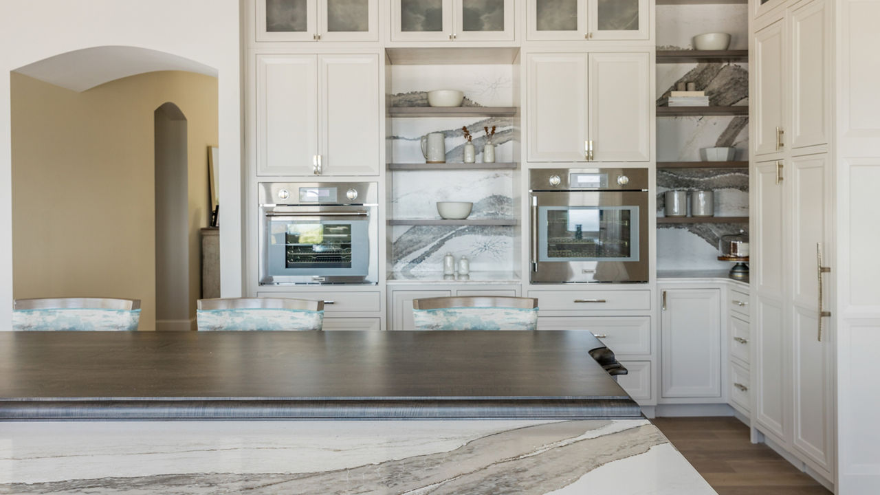
Drawing from the flow and muted colors of the water and vegetation outside the window, Lopez used the movement of Cambria’s Skara Brae design on the kitchen countertops and backsplash to soften the hard lines.
Here, how to create the ultimate support system with Cambria shelving.
Modern Desert-Style Home
Inspired by the newly released palette of sundrenched hues that Benjamin Moore paired with its 2021 Color of the Year Aegean Teal, we are calling it: Modern, desert-style design will be “in” in 2021.
Soothing, sunbaked tones create an emotional connection with one’s surroundings. Never has it been clearer that the home is a place of comfort, restoration, revitalization, and rejuvenation, and the need to find simple moments of joy has become paramount.
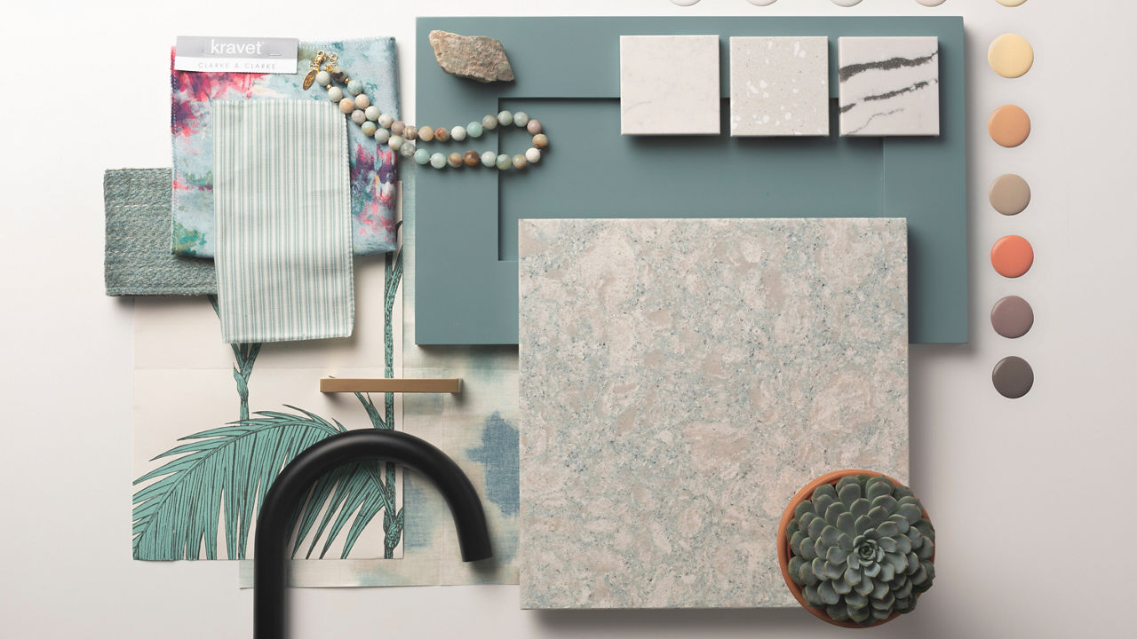
Take inspiration from this moodboard featuring Cambria designs—like Whitby™, Sanibel Shoreline™ (Gensler product design consultant), Montgomery™, and Gladstone™—paired with Aegean Teal.
The warm palette in this kitchen creates a warm and inviting ambiance with wood tones, matte black accents, and Cambria’s Buxton design on the island and backsplash.
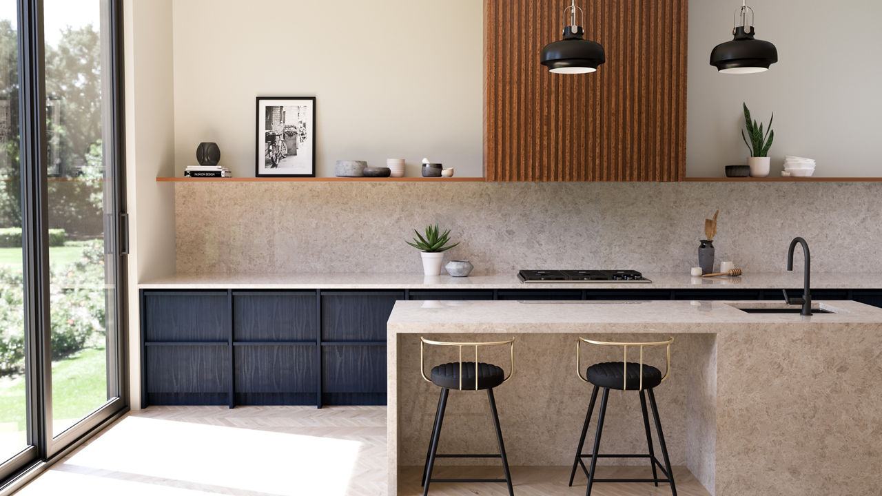
Buxton adds to the warmth of this kitchen design.
A foundation of wood lets Cambria’s Snowdon White™ be the star of the show in this modern kitchen by Pine Street Carpenters.
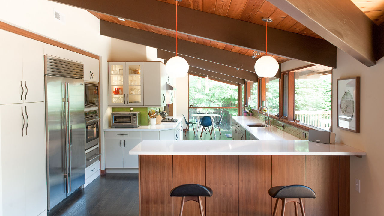
The pairing of white and wood is both modern and inviting.
[Updated on 12/05/2023]
Discover More
Get our beautifully curated collection of lifestyle stories, interior design trends, and expert advice sent straight to your home and email inbox with a complimentary subscription to Cambria Style magazine.
Ready to explore Cambria quartz designs in person? Contact a Cambria consultant or use our retail locator to find a professional in your area for project support and planning, material selection, or visualizing what’s possible.
Explore the #MyCambria Gallery to see how others transformed their spaces and follow us on social media.
Get the Look
Explore the designs featured in this story.


