No. 1: Simple Elegance
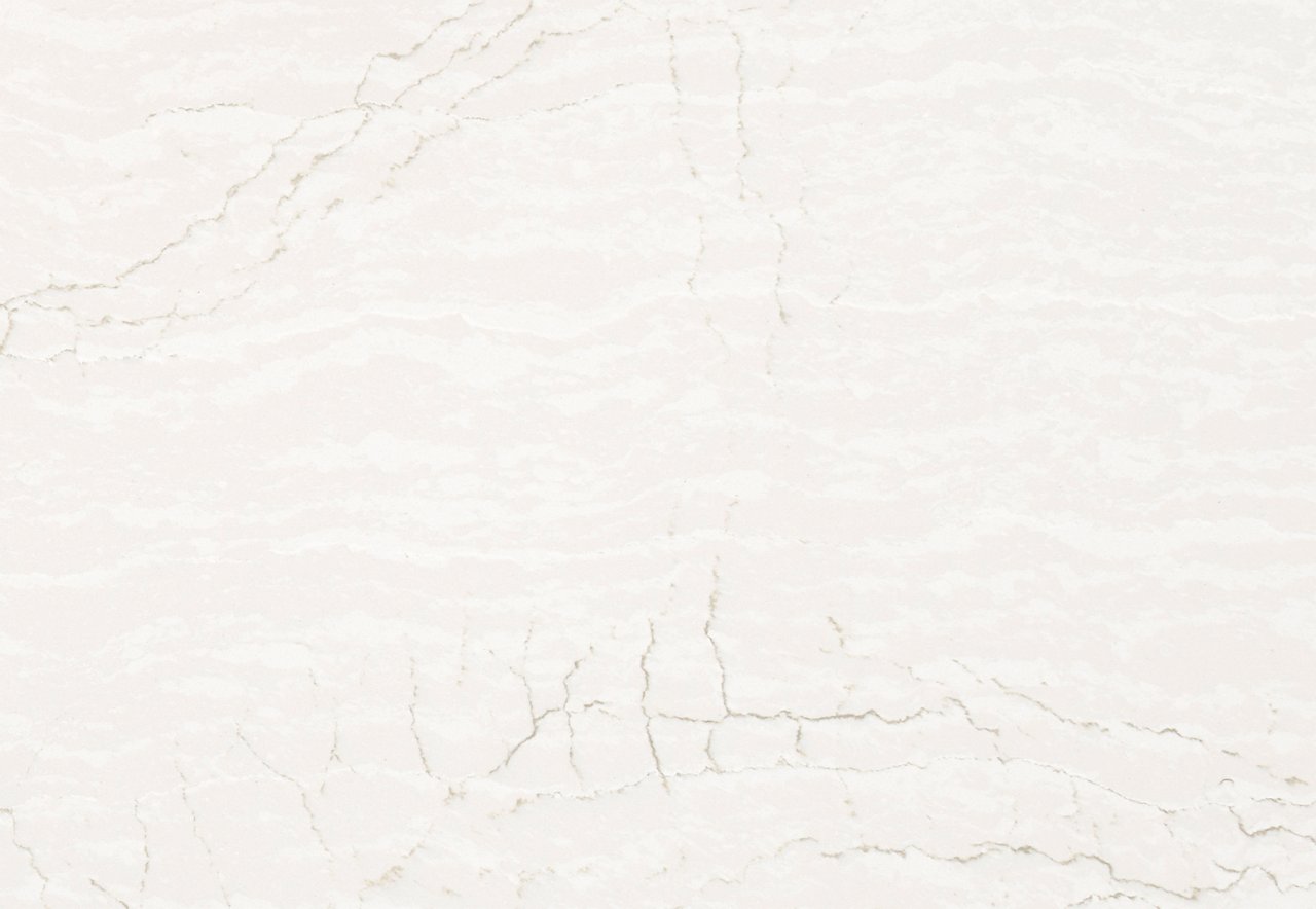
Christopher Peacock has spent three decades perfecting his signature blend of timeless style and top-flight quality in cabinet and kitchen design. In the eponymous Christopher Peacock cabinetry showroom in Boston, the designer combined his Hudson cabinet line with custom brass hardware and liberal helpings of Cambria—Brittanicca Warm Matte™ on the walls, White Cliff Matte™ on the counters—to sleek effect. “I wanted this space to reflect the Boston metro location, hence the simpler lines and more modern aesthetic,” he says.
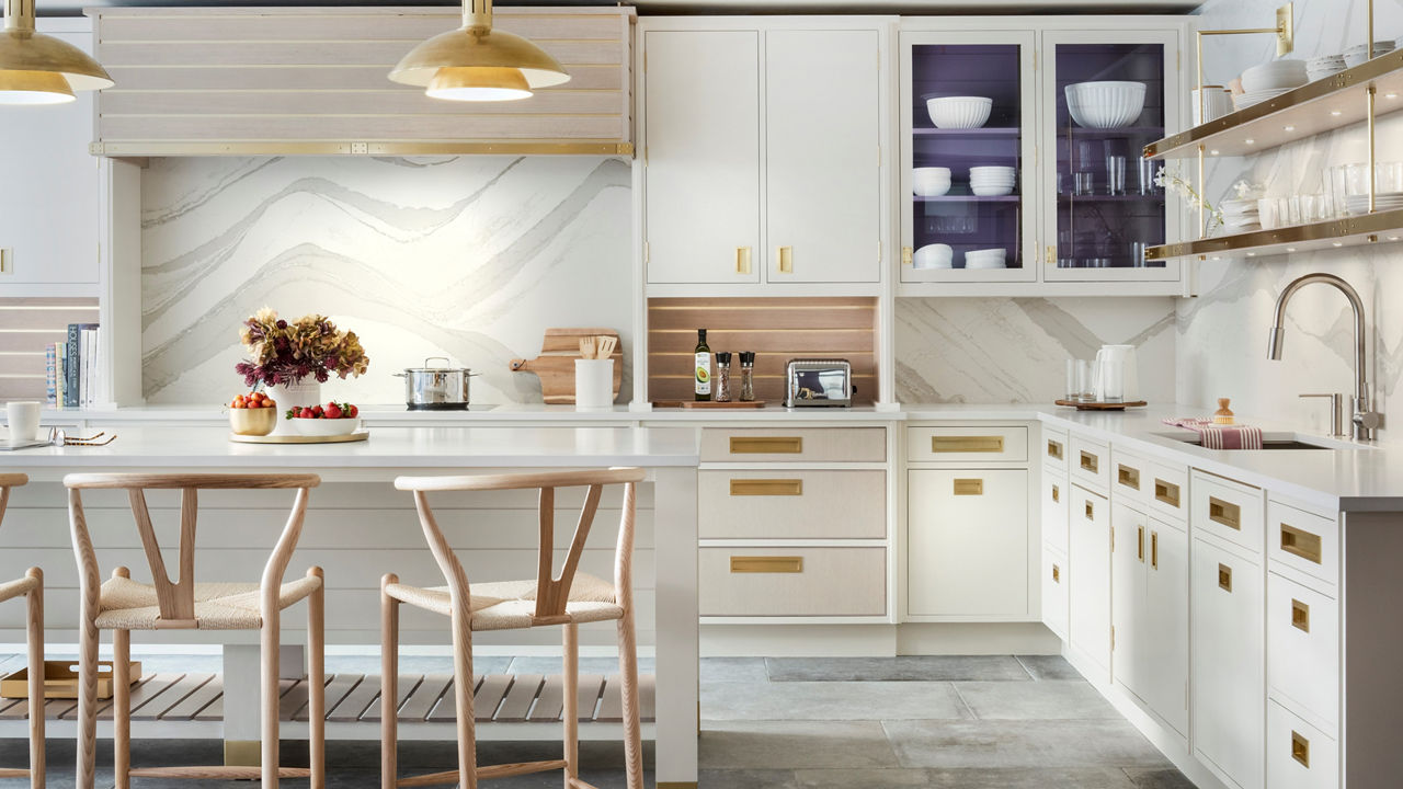
The colors and undulating movement of Cambria Brittanicca Warm Matte enliven these kitchen walls without overtaking the streamlined style. Photography by Neil Landino.
No. 2: Mountain Modern
When a Durango, Colorado, couple wanted a fresh look for their longtime home, they turned to Denver-based designer Gina D’Amore Bauerle to handle the update. “It’s a timber-frame house, so the trick was creating a more modern look while working with the strong architecture,” she says. Replacing the original black countertops with a mix of two light Cambria designs, Delgatie™ and Devon™, immediately brightened the large kitchen and created durable prep-and-serve surfaces for entertaining their adult children, friends, and family. Transforming a breakfast nook into a bar—complete with a focal-point teal backsplash tile—and adding a sliding glass door to link indoors and out completed the sophisticated transformation.
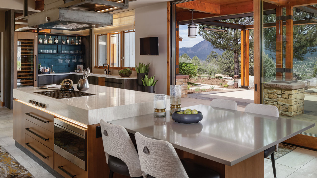
The Cambria Delgatie-topped island makes an impact with a six-inch, deep edge, super-sleek cooktop installation, and the glow of led lighting along its perimeter. Photography by Tim Gormley.
No. 3: Bright Outlook
It’s not every day you see a kitchen with yellow cabinets, pink pendant lights, and a blue and white backsplash, but in this Canadian kitchen designed by Martin de Sousa of Toronto’s Designström, the unexpected mix works. “After we made the layout more functional, the owners’ personalities guided the design: the husband’s Moroccan heritage influenced the choice of the clay tiles, and the wife has a very colorful style—the yellow cabinets were her idea,” says de Sousa.
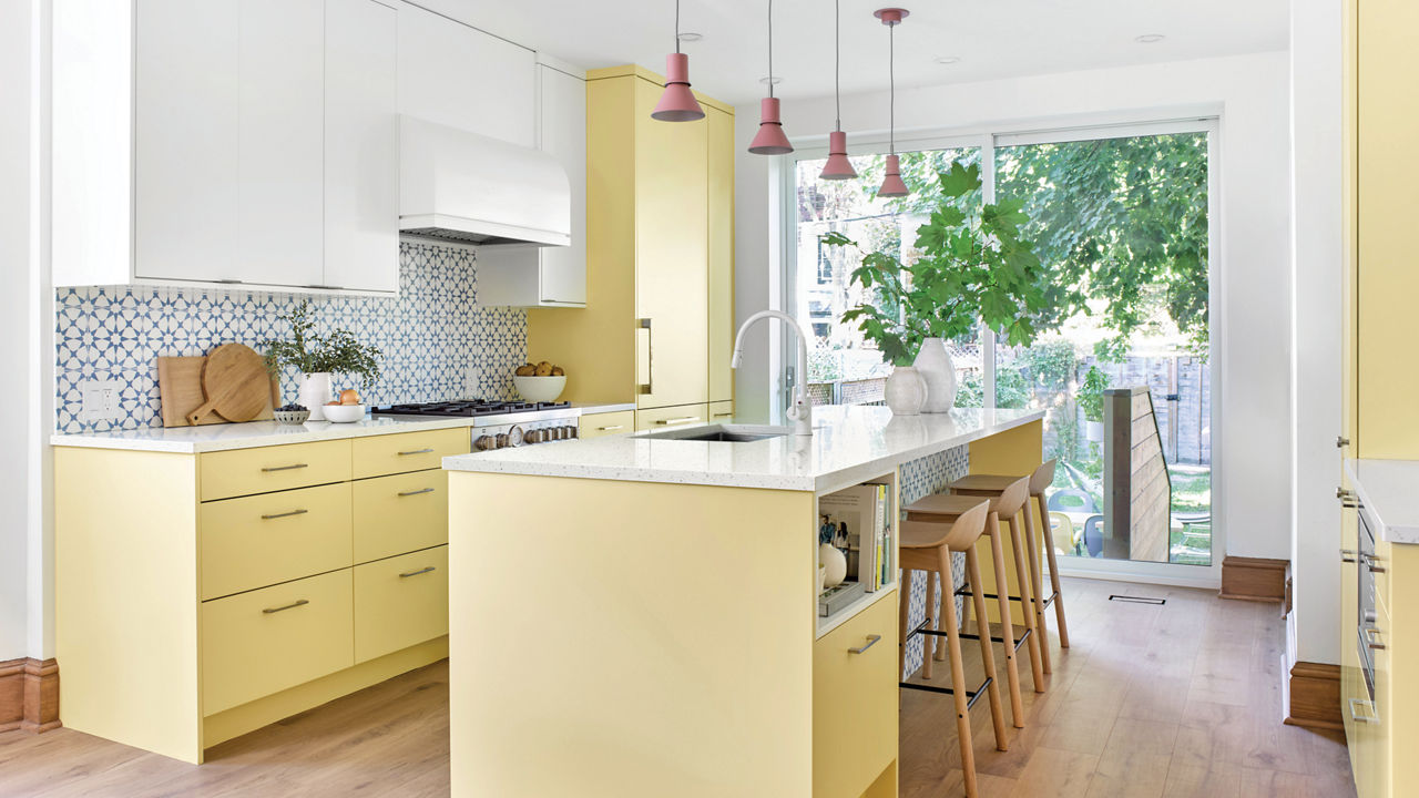
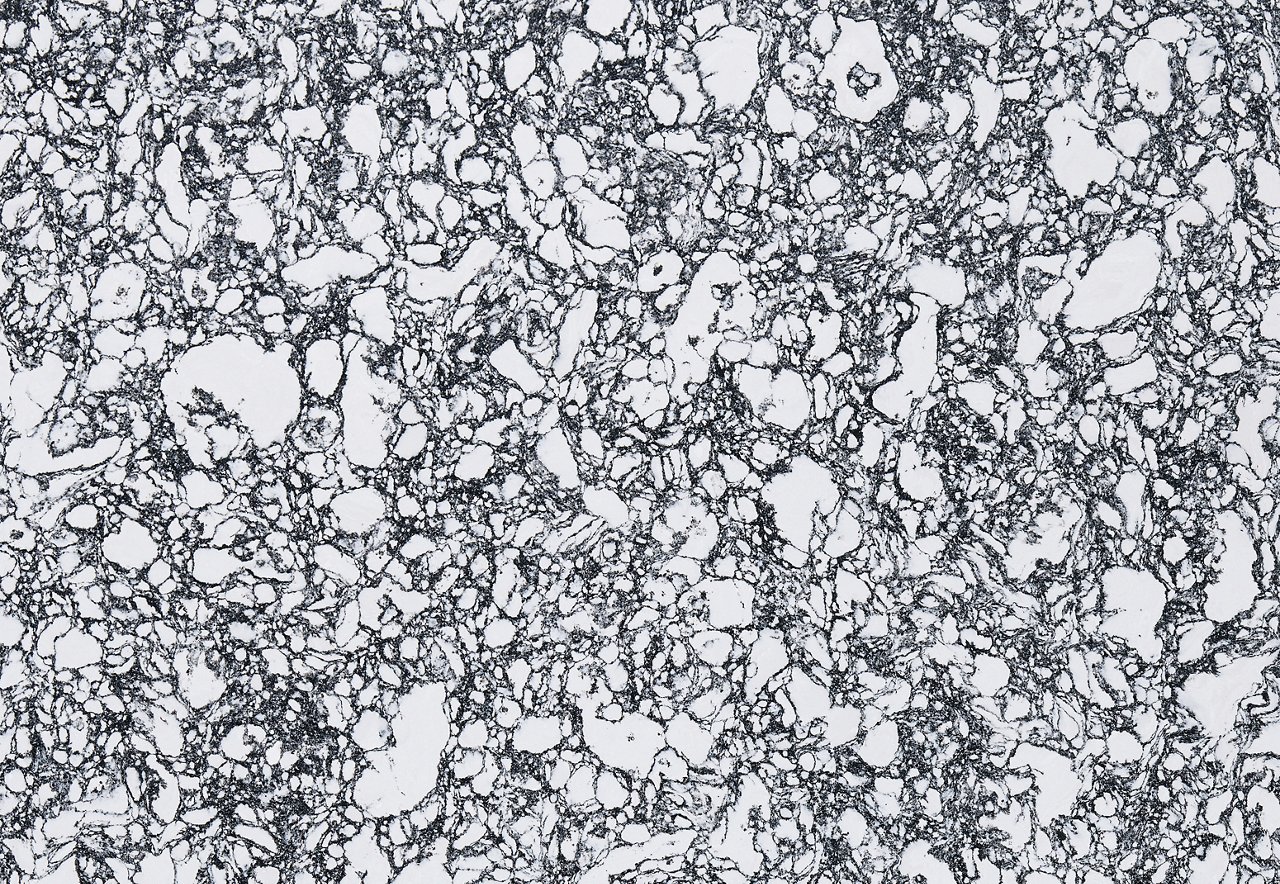
Liberal splashes of calming white—Cambria's terrazzo-look Salt Lake™* design on the counters and Benjamin Moore’s Simply White on the upper cabinets—help balance the vibrant hues. Photography by Vincent Lions.
No. 4: Mellow Drama
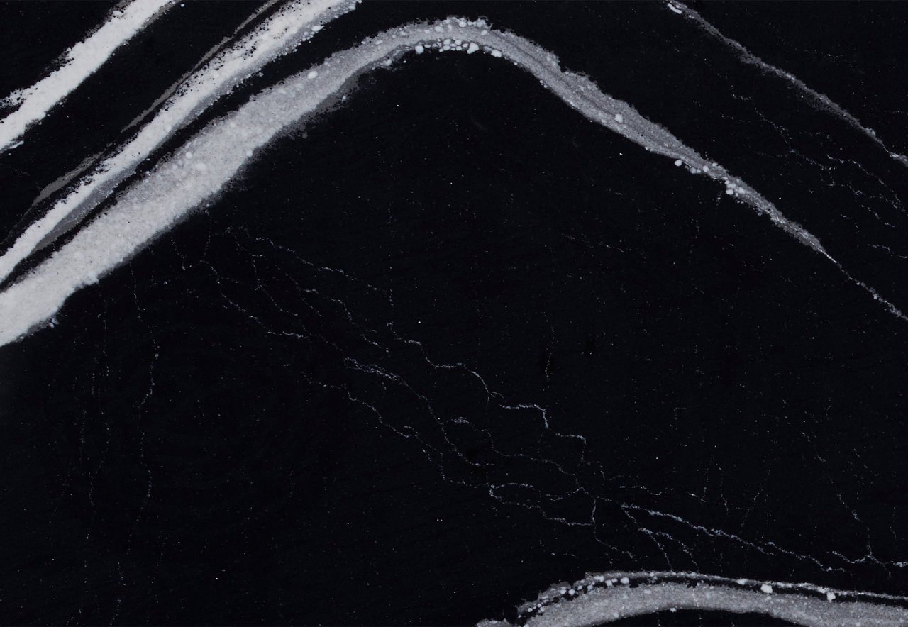
Designer Traci Connell incorporates Cambria’s Mersey™ as a common element to marry a masculine and feminine vibe in this his and hers en suite bathroom. The luxury of the vanity’s black and white design flows over the edge to show off the dramatic pattern. And in this “his” portion of the space, it’s paired with custom-scored and dark stained oak millwork and cabinetry and a vessel sink, all under the soft glow of burnished gold sconce lighting.
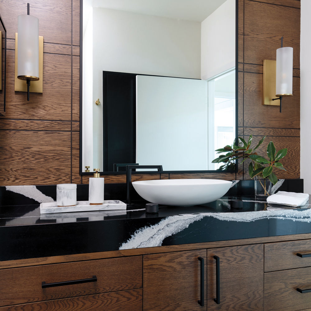
The black and white of Cambria’s Mersey design is sophisticated enough to suit both feminine and masculine styles, and its durability make it a no-brainer for a bathroom. Photography by Michael Hunter.
No. 5: Party Ready
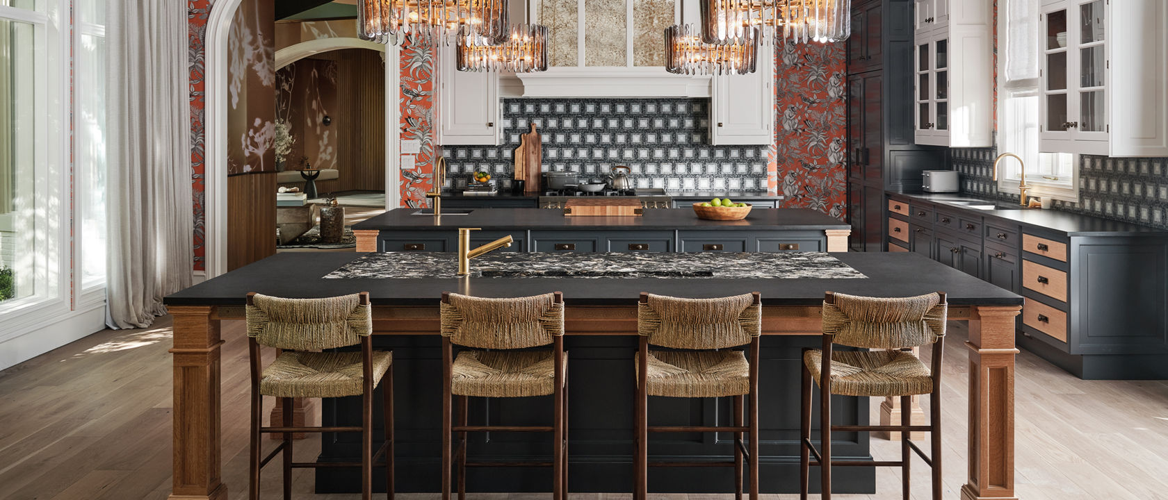
For the third annual Kips Bay Decorator Show House Dallas that benefits the Kips Bay Boys & Girls Clubs, designer Christopher Peacock created an exquisitely appointed entertaining suite with a kitchen, butler’s pantry, and food pantry. To help organize the main kitchen, he created a double-island design—one for food prep and one for gathering—both topped with Cambria. He gave his own Lambourne cabinet design a two-tone finish for a furniture-style look. And then he layered on the details—playful wallpaper, mosaic tile, sparkling chandeliers—for an effect that’s as unexpected as it is irresistible.
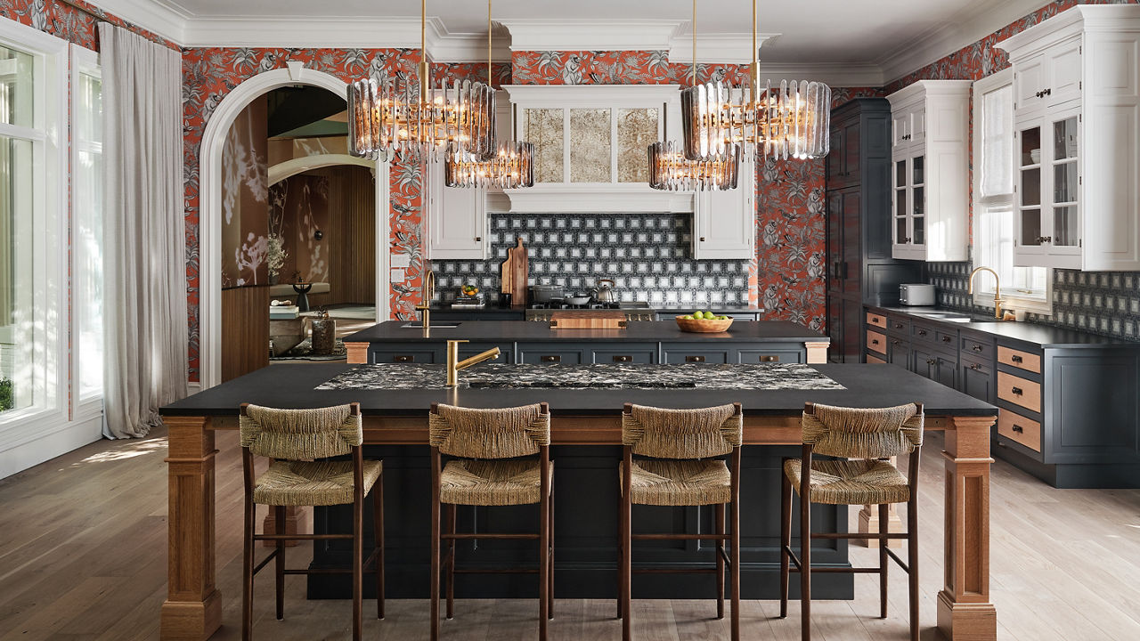
Combining the bold pattern of Cambria’s Hollinsbrook Matte™ design with simple Montana Midnight Matte™* creates natural focal points and helps break up large expanses of surface. Photography by Stephan Karlisch.
No. 6: Statement Style
Houston-based interior designer Lucinda Loya leaned into her favorite Cambria design, Rose Bay™, to give the adjoining bathroom en suite she designed for the 2022 Kips Bay Decorator Show House Dallas an appropriately showstopping style. The entire vanity wall is clad with the material, and a collection of oval mirrors—cleverly turned on their sides—adds drama with their bold geometry to help visually expand the small space. Glimmering mosaic tile on both the floor and ceiling complete the jewel box effect.
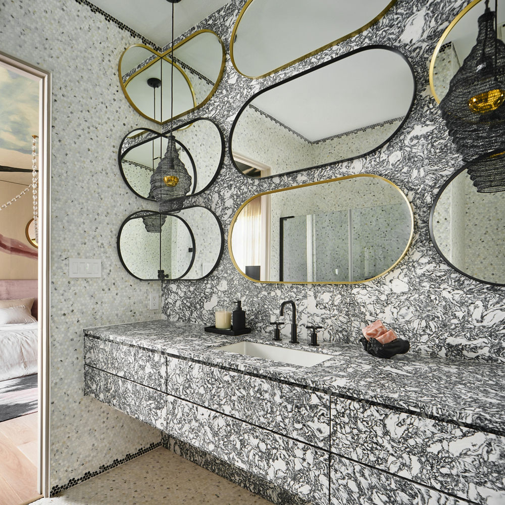
Cambria’s Rose Bay Matte™ design dominates this luxurious space, transitioning beautifully to penny-round tiles on the walls and floor. Photography by Stephan Karlisch.
*Gensler Product Design Consultant
[Updated on 12/05/2023]
Discover More
Get our beautifully curated collection of lifestyle stories, interior design trends, and expert advice sent straight to your home and email inbox with a complimentary subscription to Cambria Style magazine.
Ready to explore Cambria quartz designs in person? Contact a Cambria consultant or use our retail locator to find a professional in your area for project support and planning, material selection, or visualizing what’s possible.
Explore the #MyCambria Gallery to see how others transformed their spaces and follow us on social media.
Get the Look
Explore the designs featured in this story.


