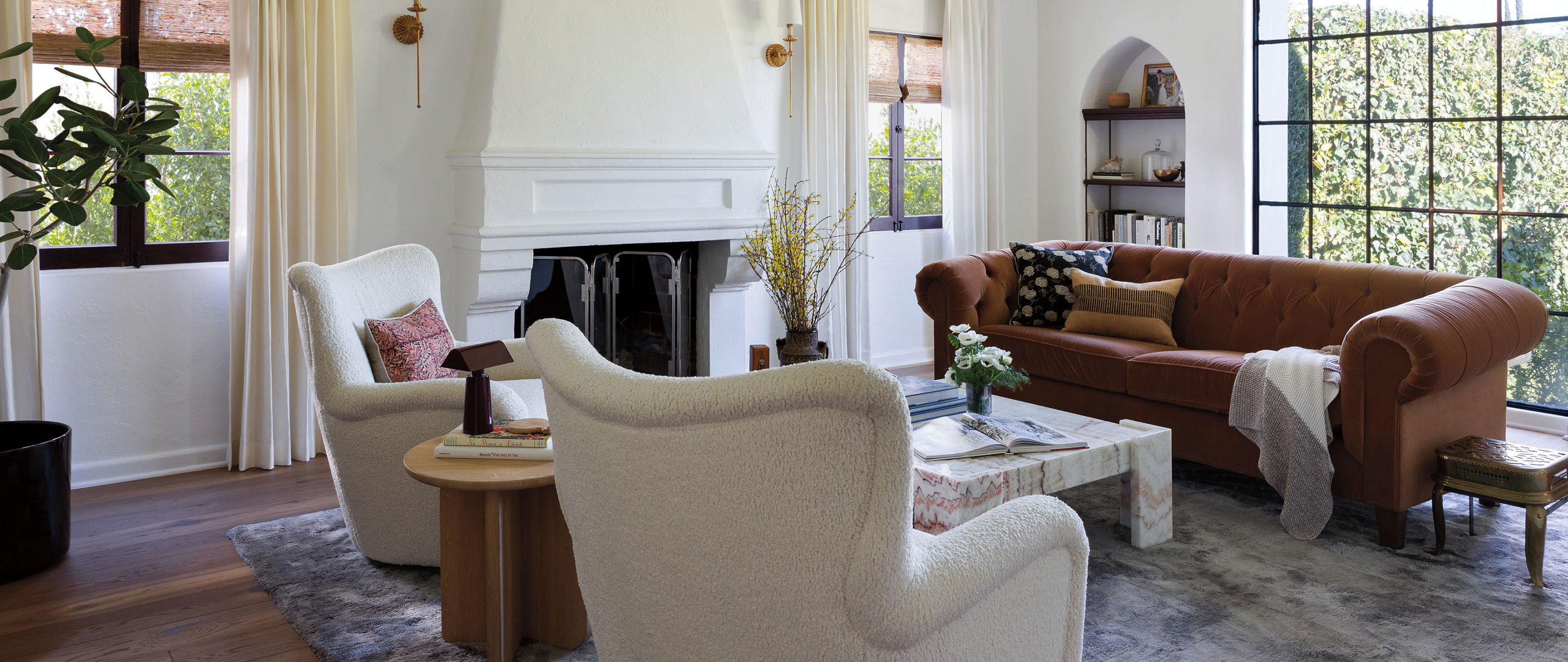
Kelli and Tim Lamb didn’t find their new home right away. A pandemic and a competitive housing market saw to that. But after 18 months and losing out on 12 properties, these first-time homebuyers finally have a place to call their own: a 1928 Spanish Revival house in Altadena, just outside Los Angeles, at the foot of the San Gabriel Mountains.

Equipped with a banquette and café table, the dark and moody kitchen goes effortlessly from breakfast to the wee hours. Cambria design shown: Delamere Matte™
Having previously rented a bungalow that had been retrofitted on an open plan, Kelli—the editorial director of the lively design publication Rue—was delighted to find a house that stood old style, with separate spaces for the living room, kitchen, and dining room, and bedrooms situated on their own down a hallway. “I was excited that we’d be able to give each room its own identity,” she says. “It was also exciting to have higher ceilings and more space to work with. We could play with larger light fixtures and have oversized, comfortable furniture.”
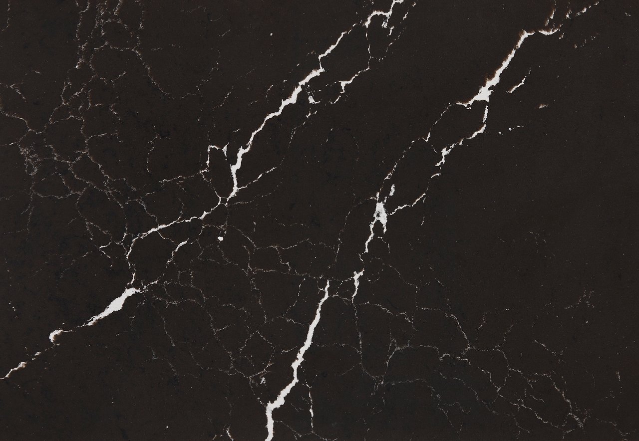
While taken with the home’s clearly defined spaces and architectural charms—including beamed ceilings, arched doorways, and a substantial fireplace—the couple knew it could use a little work and turned to Patrick Maziarski of Beau Geste Interior Design. “I had admired his work for years and was drawn to his style,” says Kelli, “masculine, with interesting details and plenty of dark colors and finishes.” That penchant plays out most forcefully in the Lamb’s reconfigured kitchen, where the cabinetry is painted in Sherwin-Williams Greenblack, the counters sport Cambria’s Delamere Matte, and a bold grid pattern from Granada Tile covers the floor.

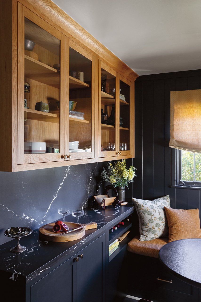
Cambria’s Delamere Matte partners seamlessly with the dark walls and cabinetry.
“The kitchen is such a statement, and I feel the matte finish of the Delamere tones it down a touch, adding a softness,” notes Kelli. As for that eye-catching floor, she says, “Early on, we thought we might do something more literal, a Moorish pattern, for example, that would feel like it had always been part of the house. But Patrick came up with this custom pattern. The result feels really new and fresh, while simultaneously feeling right at home in this house.”
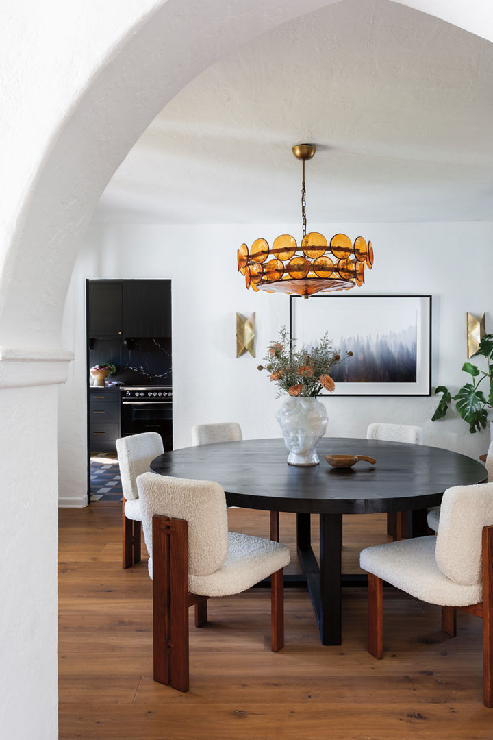
In the dining room, a custom dining table and Lulu and Georgia chairs upholstered in white bouclé.
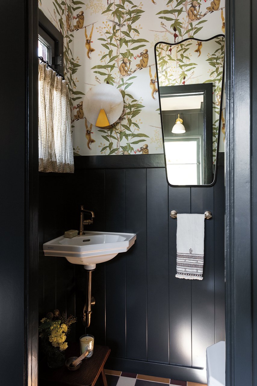
The powder room, outfitted with Duravit’s 1930 Handrinse Basin and adorned with whimsical wallpaper from Astek.
When it came to furnishing the home, Kelli was willing to take her time. “In my years as a design editor, I’ve found the homes that are not done right away tend to be the most interesting. While we both had a craving to move in and have everything be ‘done’ right out of the gate, I knew we needed to live in the space and really get to know not only the house, but the neighborhood and our routines, to better inform the décor.” Her commitment to getting things right left friends wondering what was going on. “We had art leaned up against the walls for well over a year, sheets tacked over the windows, and the dining room light fixture in its original box in the living room,” admits Kelli. “But we didn’t want to rush to fill the space with temporary furniture, we wanted to be intentional.”
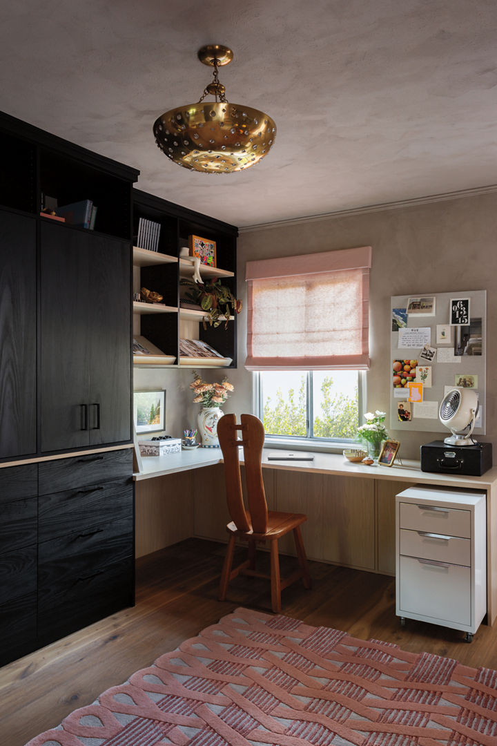
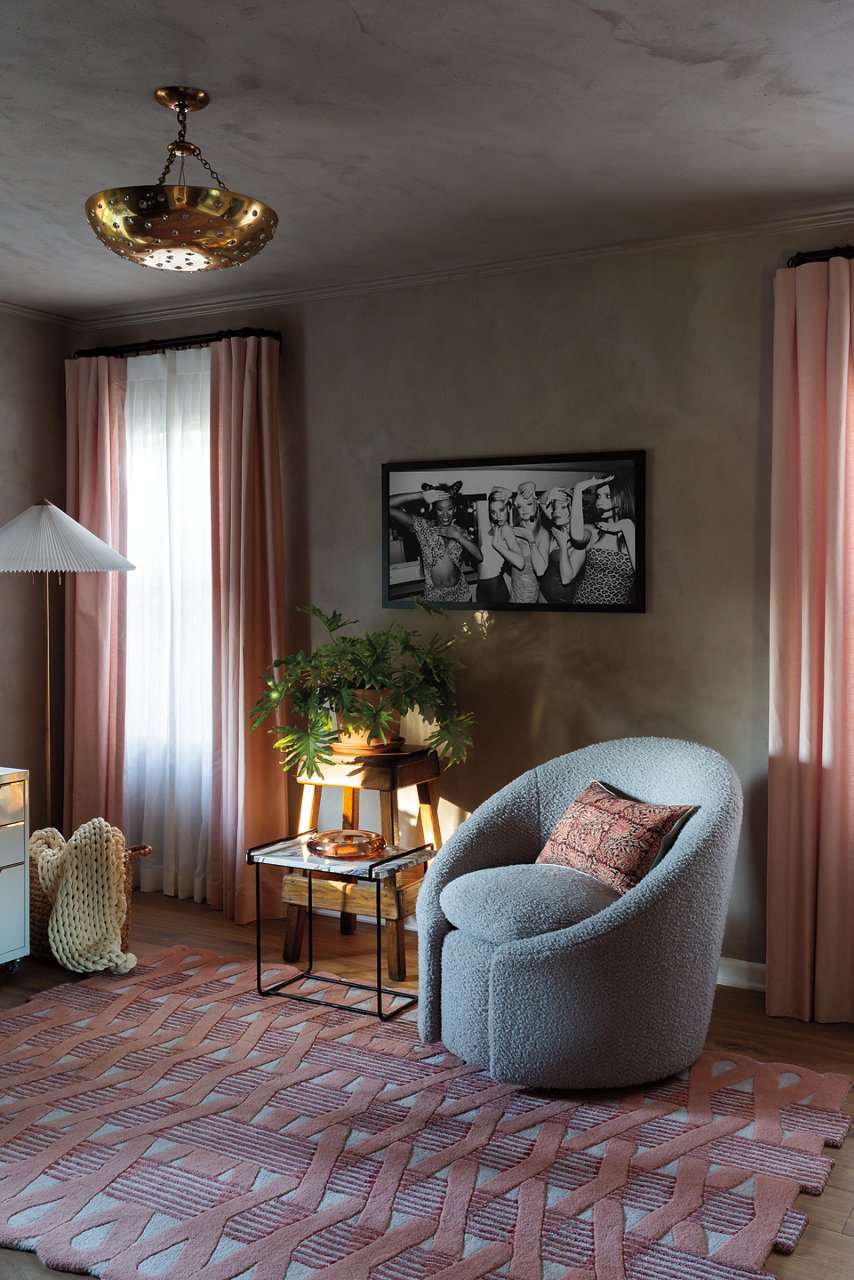
The home office is equipped with a custom workspace from California Closets and graced with a lovely pink rug from Jaipur Living.
Kelli’s measured, methodical approach has resulted in rooms that look both fresh and settled, stylish yet entirely livable. Her office has—in the best sense—a relaxed, almost repurposed look, like a bedroom that’s been given a new life. Although outfitted with a workspace, complete with file cabinet and magazine shelves, with its pink rug and window treatments (plus a framed photo of the Spice Girls, back in the day) this room is wonderfully not all business. On the other hand, her living and dining rooms strike a proper but far from stuffy note. While set with substantial upholstered pieces from Mitchell Gold + Bob Williams, the window-blessed living room is an open, uncluttered space. The dining room features a conversation-friendly round table, and a Lorenzo Chandelier from Soho Home made of amber glass is a nice contemporary touch that complements the original architectural style of the home.
Family treasures—paintings by Tim’s father, artist Jim Lamb, a brass footman trivet that belonged to Kelli’s grandfather—and pieces gathered here and there (a gold leaf saber-toothed tiger skull, a vase from the Ukrainian brand Gunia Project) add another layer of personality to these interiors. There’s no doubt about it: This is a home that looks as if it came about naturally, effortlessly. It didn’t happen overnight, but clearly, slow and steady wins the race.
Discover More
Get our beautifully curated collection of lifestyle stories, interior design trends, and expert advice sent straight to your home and email inbox with a complimentary subscription to Cambria Style magazine.
Ready to explore Cambria quartz designs in person? Contact a Cambria consultant or use our retail locator to find a professional in your area for project support and planning, material selection, or visualizing what’s possible.
Explore the #MyCambria Gallery to see how others transformed their spaces and follow us on social media.
Get the Look
Explore the designs featured in this story.


