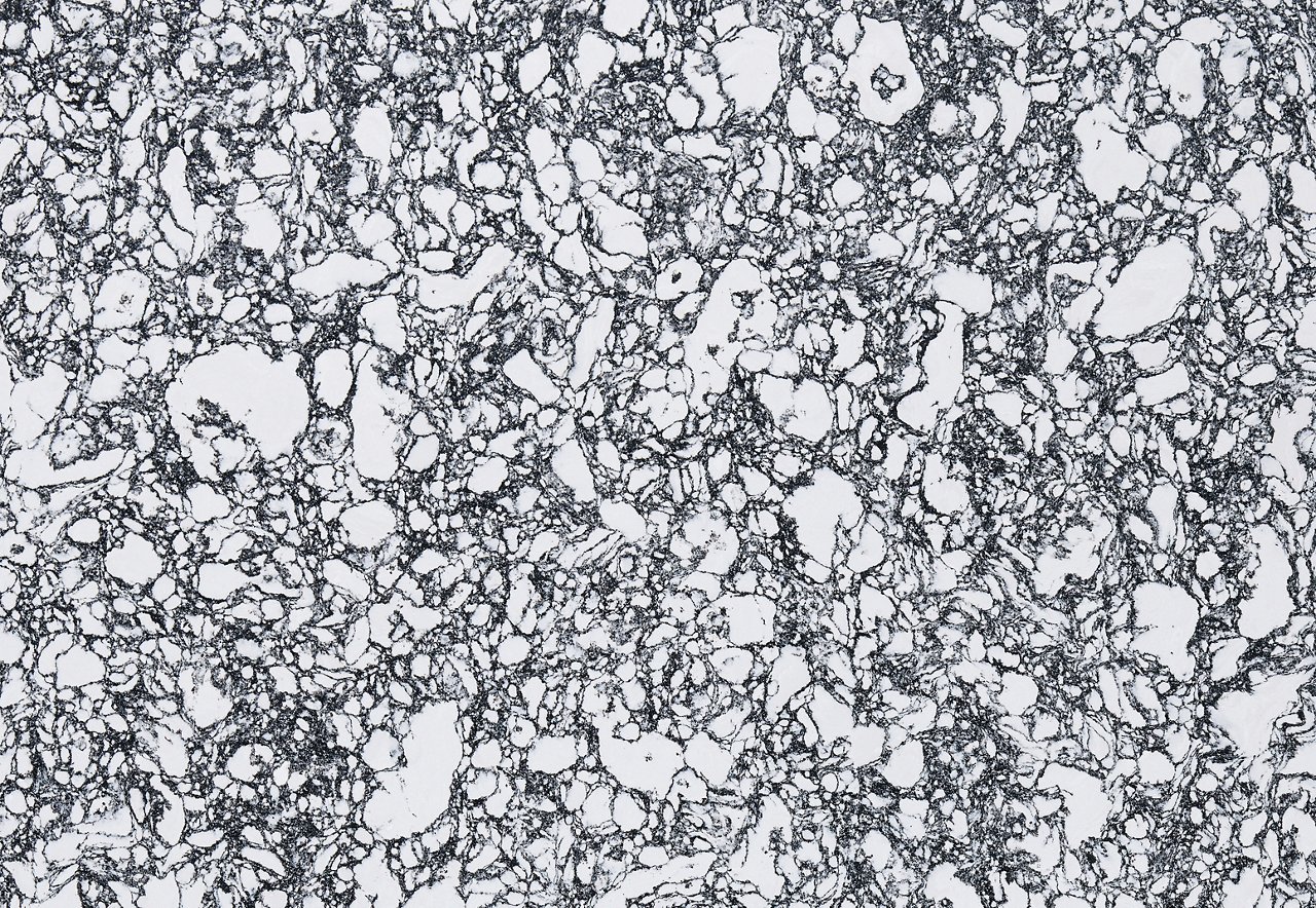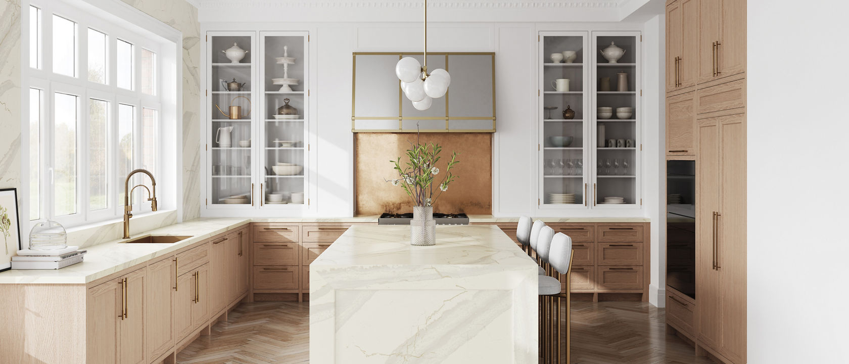
Cambria design shown: Inverness Swansea™ in a matte finish
Embrace the freedom to blend design styles and create spaces that feel fresh yet familiar with inspiration from these six designers.
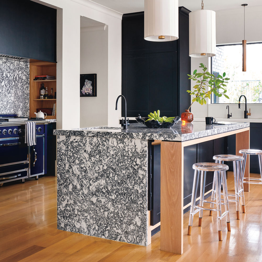
Cambria designs shown: Rose Bay™ and White Cliff®; Photography by Nathan Schroder
1. Contemporary by Nature
When architect Eddie Maestri and his team at Maestri Studioopens in a new tab began the major renovation of this home, one feature was already perfect: Its lakeside setting in a charming suburb of Dallas. Director of Interior Design Katie Paulsen says they drew on the surroundings at every turn, pulling in natural elements while keeping the overall look contemporary. In the kitchen they used a black and white palette—including Cambria Rose Bay and White Cliff—for graphic contrast, plus plenty of wood for warmth. The blue range references the sparkling lake outside.
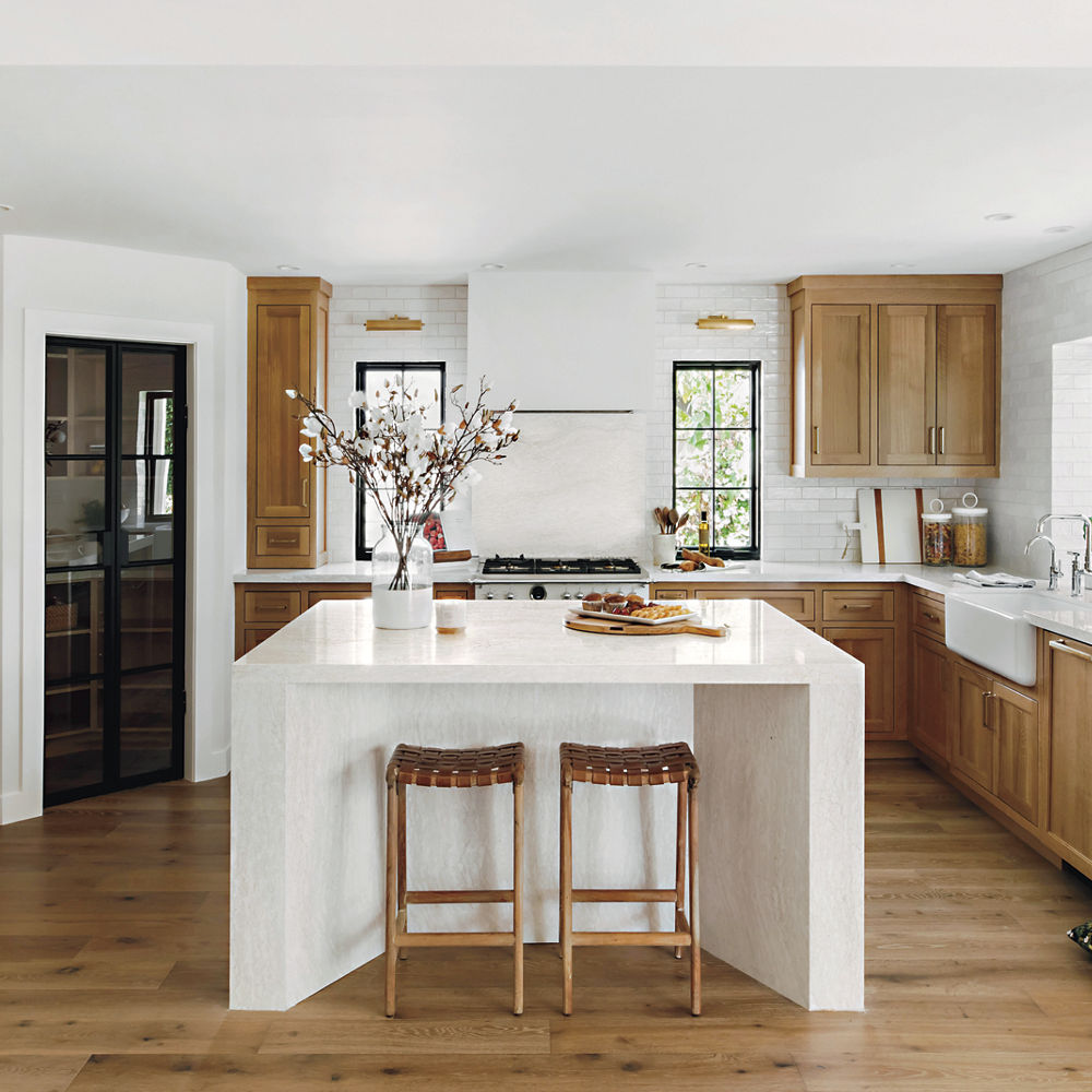
Cambria design shown: Ironsbridge®; Photography by Public311 Design
2. The Right Angles
Designer Ethan Greenfeldopens in a new tab had an unusual understanding of the owners of this L.A. kitchen: They’re the parents of a childhood friend, and he knew their previous home well. With the help of that personal tie, he worked to bring their welcoming personalities and “modern traditional” style to the new space. Then he added a strong focal point with an angled island wrapped in Cambria Ironsbridge. “The fabrication was very complex, because every piece had to be mitered so precisely,” he says. “But the result is very special.” Just like his clients.
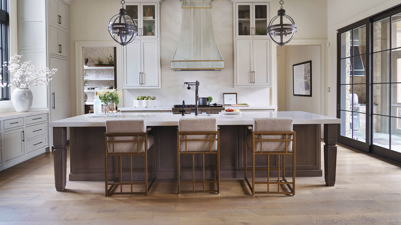
Cambria design shown: Ironsbridge; Photography by Lisa Hubbard.
3. Old-World Accents
When asked to give the kitchen of a new house a design that felt timeless—and could stand up to the demands of a young family—designer Leslie Murphy of Nashville’s Murphy Maude Interiorsopens in a new tab took the challenge in stride. She chose a classic cabinet style and mixed painted and wood finishes to create a gently “collected” look. Then she added generous expanses of Cambria Ironsbridge for bright, elegant, kid-friendly contrast. “We wanted to bring in a lot of natural materials to reference the home’s beautiful setting, and to make it feel like it had some life and age,” she says.
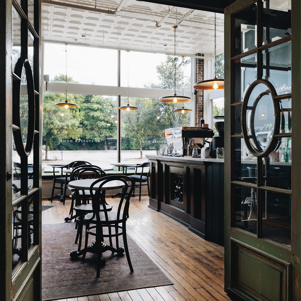
Cambria design shown: Smithfield®; Photography Jon Stoffer
4. Timeless Appeal
When interior designer Jean Stoffer decided to add a European-style coffee bar, “The Bradbury,” to her Stoffer Homeopens in a new tab retail store in Grand Rapids, MI, she wanted the space to have “an incredible ambience, so it would become a destination.” It also had to function well for food and drink service—which meant hygienic, easy-care materials. Cambria Smithfield on the counters and open shelves have a classic look that fits the bill perfectly. A mix of antique wood, deep green paint, and black pendant lights lined with reflective gold complete the cozy atmosphere.
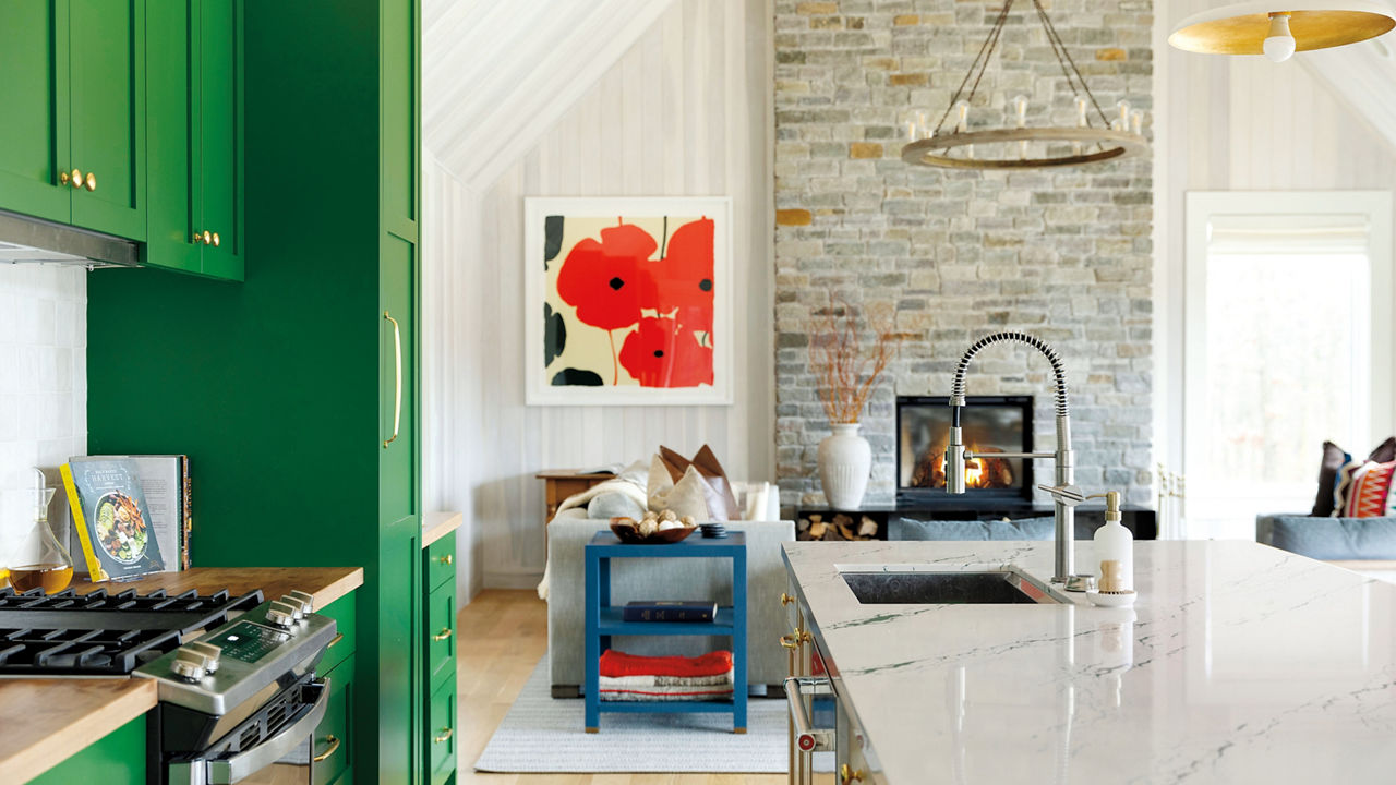
Cambria design shown: Ivybridge™; Photography by Spacecrafting
5. Bright Personality
To give a Wisconsin lakeside cabin a fun, vacation vibe, designer Gabby LaBoy of Martha O’Hara Interiorsopens in a new tab went with a somewhat unexpected splash of color in the kitchen. “For most of the cabin we kept things quiet—neutral colors, poplar paneling, natural stone—but I knew a bold color would raise the energy,” she says. LaBoy chose bright green because the extended family of owners uses the cabin year-round. “It’s refreshing to have a color inside that you’re not seeing in nature during those long, cold days.”
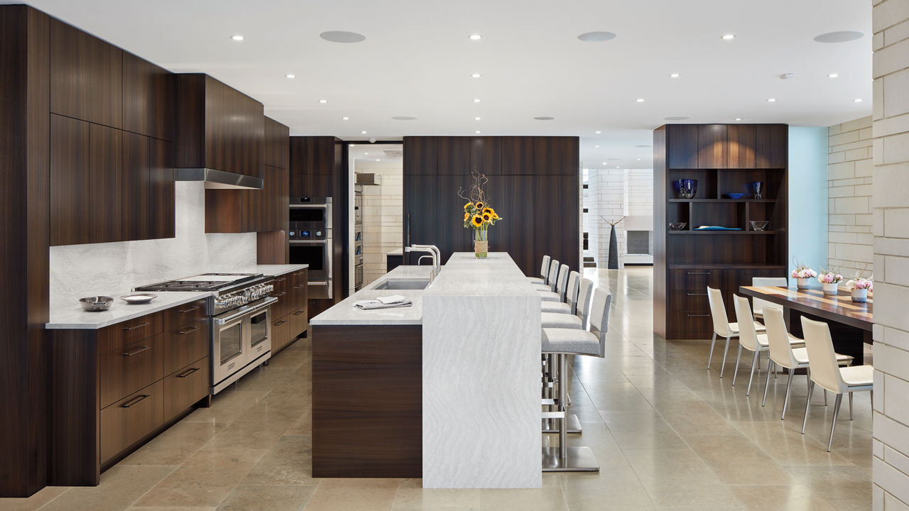
Cambria design shown: Ironsbridge; Photography by Corey Gaffer
6. Comfortable Contemporary
How do you create minimalist interiors that still feel inviting—and stand up to busy family life, too? That was the challenge facing Kim Streeter, lead designer of Charles R. Stinson Architecture and Designopens in a new tab. “We thought really carefully about the palette and the aesthetic to make sure every room felt comfortable,” says Streeter. To achieve that effect in the kitchen of this Minnesota lake home, Streeter worked with tones of brown and blue (the color palette of the owners’ wedding) plus splashes of white for brightness, and plenty of texture for depth. The result is sleek but not stark, and tough enough for lakeside family life.
Discover More
Get our beautifully curated collection of lifestyle stories, interior design trends, and expert advice sent straight to your home and email inbox with a complimentary subscription to Cambria Style magazine.
Ready to explore Cambria quartz designs in person? Contact a Cambria consultant or use our retail locator to find a professional in your area for project support and planning, material selection, or visualizing what’s possible.
Explore the #MyCambria Gallery to see how others transformed their spaces and follow us on social media.
Get the Look
Explore the designs featured in this story.


